What is a logotype, an emblem of an enterprise, a logo?
A logo identifies a business in its simplest form via the use of special typeface – it is a graphic element, symbol and icon of a trademark or brand, created in the shapes, colors and fonts usually different from others in a similar market. The principal function of a logo is to create a memorable and recognizable impression on the mind of a potential client or customer.
Why choosing a logo is essential?
Touching upon the subject of a company’s logo, your perspective clients will usually consider the following:
The number one reason for applying the proper, unconventional logo is branding. Naturally, people are more inclined to remember the logo before the name of the company. A logo design really should be synonymous to eye-stopper – strict and laconic but remarkable; sophisticated and flashy, nevertheless unique.
Further, a good company logo design reveals professionalism, respectfulness, a certain sense of care and stability. These are all positive characteristics in a company image and the ones many potential customers are to inherently trust. An organization without a good company logo design looks either new or amateurish, something that does not inspire confidence. That is why huge number of corporations invest a lot of time and money into getting the perfect company logo design.
A good logo marks the branding objectives, expresses the meaning well and impresses the viewers enough to memorize it. As you see, even if it is a small business with local customers, a professional company logo design will help brand the company.
Do logos differ?
Traditionally, logo designs are classified according to four basic types:
Wordmark Logo Design – The most widely used of all logotypes, the wordmark focuses on text and typeface but can incorporate other elements as well.  A wordmark may be best suited for companies whose name effectively describes what they do (Office Max, Home Depot) Logically, a literal interpretation of the words is often necessary. A wordmark is often text only with unique typographic treatments (Microsoft, Sears, Yahoo). The representation of the word essentially becomes a symbol of the company.
Lettermark Logo Design – Similar to a wordmark, a lettermark is a wholly typographic mark, usually involving initials or abbreviations. Monograms and anagrams are lettermarks. The representation of the letter(s) essentially become a symbol of the company.

Brandmark Symbol – A simple but strong graphic symbol, often abstract, that complements an aspect of a business or service and represents a company by association (Think of NIKE or Apple.)
Iconic Logotype – Iconic logotypes are also known as combination marks. An iconic logotype is usually a mixture of a brandmark symbol with a wordmark. The combination can be loose or integral. With a loose combination, the elements can be used together or separately. A well designed iconic logotype can effectively communicate what a company does as well as reflect the company personality.
How does one create a logo?
Of course, there have been many discussions concerning the “ideal logo” design (remember the worldwide known companies Nike, Coca-Cola, Apple, Shell etc) as well as the principles of working on one. The mentioned rules are presupposed by the functions and goals your work is to have. If you are just starting your career as an on-line web designer, you may find useful to keep to some general scheme, providing the possibility for better organization of your work.
In this connection, we advise you to rivet your attention on the following basic logo design process steps:

1. See the aim!
Make a general research Send a brief questionnaire to your client, asking to explain the basic layout of the required design. Get some knowledge of the business area, interests and personality of your client’s enterprise. – The logo must have much connection to what it is representing. Remember who is going to be looking at the logo before you think of ideas for it.
2. Feel the idea!
Make some preparatory sketches in pencil. This will help you get your ideas together. Create variations. The more variations, the more likely you are to get it right. – The logo must be easy to describe. Always choose function over innovation. However, you are to create a unique shape or layout for the logo.
3. Get into the act!
Shape
Make sure that the logo is recognizable when inverted or re-sized. Fit the logo into a square layout if possible, avoid obscure layouts. Do not combine elements from popular logos and claim it as original work. Avoid recent logo design trends. Instead, make the logo look timeless.

Color
Should look good in black and white. Avoid bright, neon colors and dark, dull colors. Do not use more than three colors.
Font
Type must be easy enough for your grandma to read. Avoid the most commonly used fonts, such as Comic Sans. Do not use more than two fonts. If the brand name is memorable, the brand name should be the logo.
Complexity
Do not use special effects (gradients, drop shadows, reflections, and light bursts). Avoid intricate details.
4. Triumph!
Perfect relations is always a two-side process. Thus, the approval of your client is the reflection of your success. Providing high quality is the hallmark of a professional logo designer. Focus on excellence of work and not the quantity of projects.

However, being a logo designer isn’t simply about learning how to use Photoshop or Illustrator. In order to be a professional, you need to learn the art of management. Without proper organization of your work, you are prone to fall behind schedule and deadlines. Designers who don’t organize and prioritize their work often end up losing clients.
Lastly, possess persistence and determination. You have to be patient and handle all criticism with calm attention. If you don’t succeed at first, try again till you do. The desire to never give up should be endless in designers. You should be willing to take up any and every task assigned to you. The way to recognition is not easy, but remember – you have all you need to go.
Impossible is nothing.
Any bright examples?
To consolidate the above, we are happy to offer you looking through + 50 Awesome Showcase of Logo Design Tutorials and Templates.









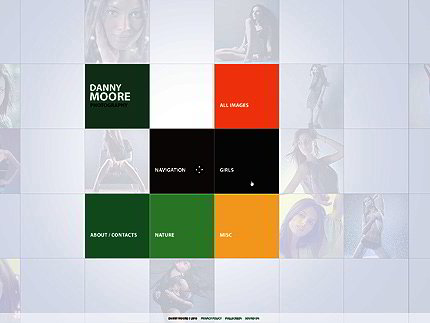

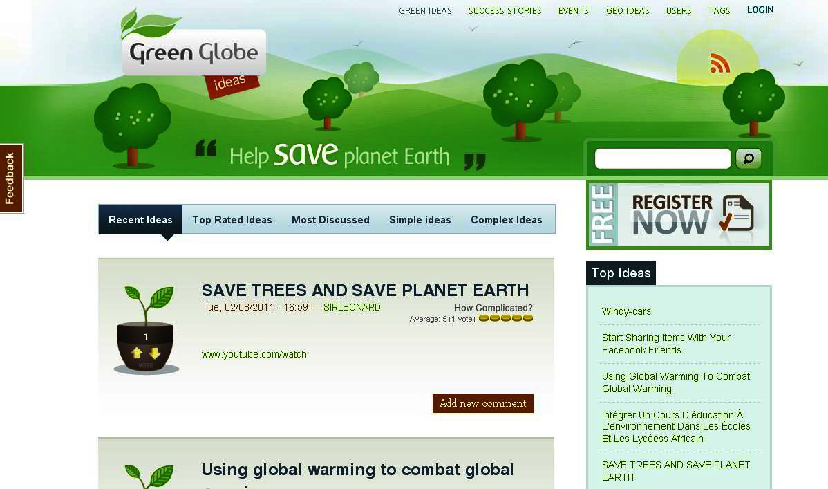
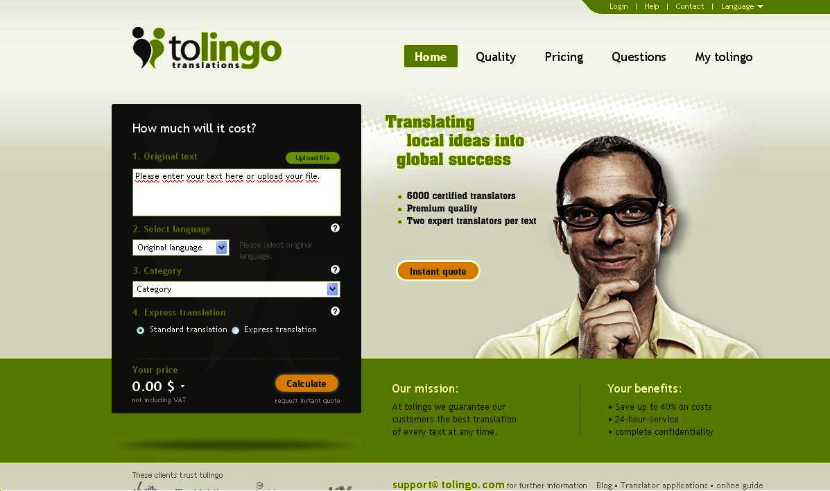
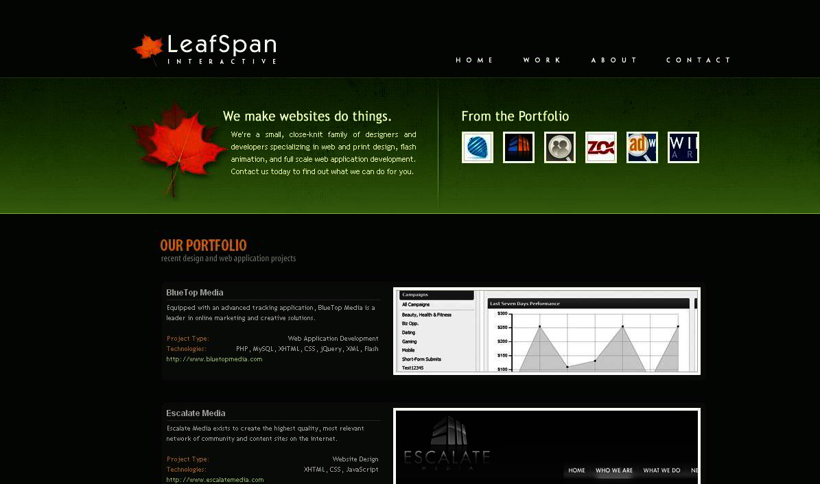
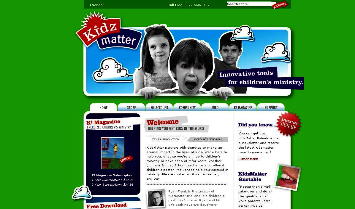
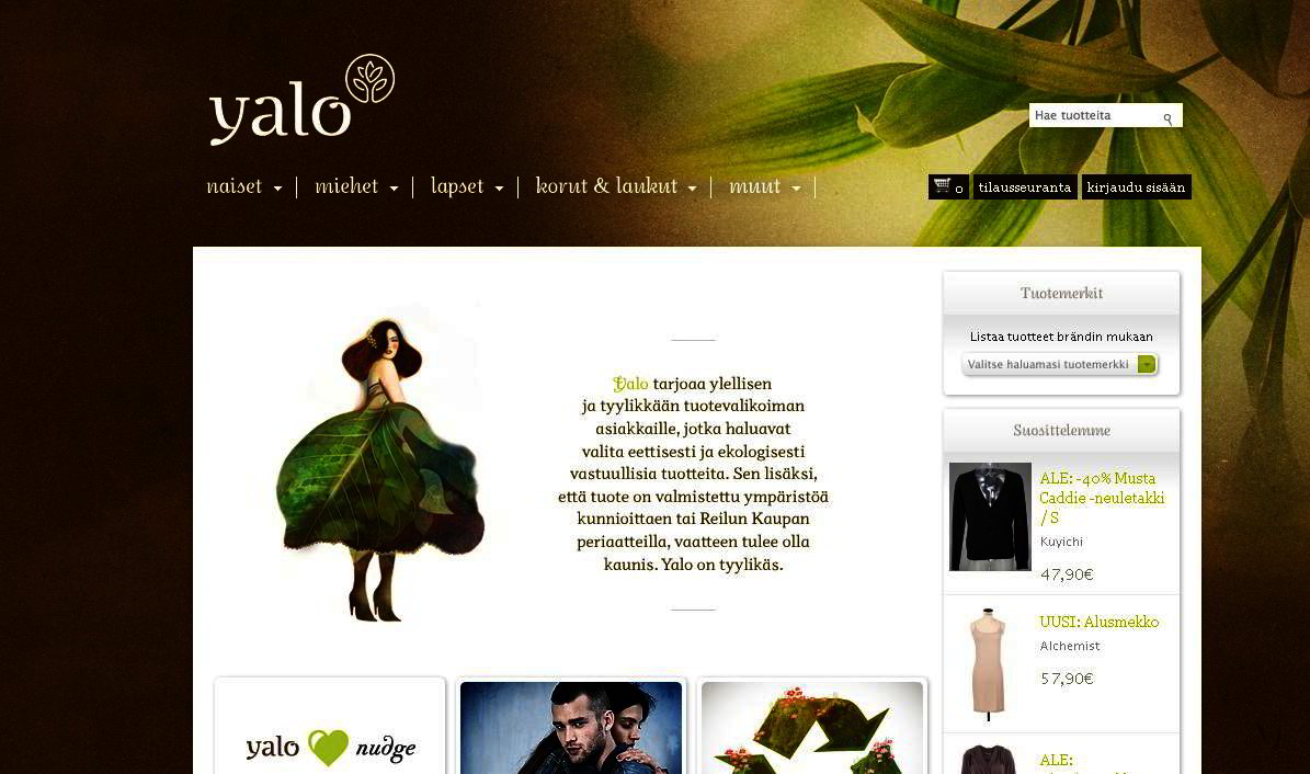





 A wordmark may be best suited for companies whose name effectively describes what they do (Office Max, Home Depot) Logically, a literal interpretation of the words is often necessary. A wordmark is often text only with unique typographic treatments (Microsoft, Sears, Yahoo). The representation of the word essentially becomes a symbol of the company.