Bootstrap is a great tool and it comes full of useful components, tools and extensions. These basic components are usually enough to start most of web projects. But there always comes a time when basic functionality is just not enough. So I gathered some of the best extensions and plugins for Bootstrap for you to use when such a day comes.
4 Reasons to Use Large Type in Web Design and How to Do It Right
It is no secret that when it comes to web design a balance between the visual elements and the text elements has to be maintained. It is not however much often thought of in balancing terms between visually expressed designing aspects and the ones that are displayed using text. Usage of expressive and large typography offers the ability of combining 2 approaches, conveying your message in a textual and highly visual manner.
In this article we will examine some of the specifics behind designing using expressive, large typography. Not only will we discuss the why’s but also some of the how’s that will help you create not only stylish but also an effective website with the use of large type.
Green Color in Web Design
If you are looking for a website template with a predominant color, you can’t just choose a particular color simply because you like it, or because it’s your favourite color. Colors have meaning to those who view them and they can affect people’s feelings, and can conjure images, memories and meanings.
Take green, for example. Green is one of the more common colors used in web design. But there is more to green than just being an attractive hue.
Want To Create A Job Board? Try WPJobBoard
Although there are many methods to make money from your blog, here I will be focusing on job boards.
A job board is something that you should consider using on your website as it is a win-win for everybody involved.
The publisher of the job gets a large audience who is going to see his ad. You, the blogger, are going to earn some money out of it. There are bloggers who charge money from the publishers, there are those who charge money from the job applicants and then there are those who do both. And finally – the job applicant could be able to find a job through the board. Everybody profits. What can be cooler than that?
Make Your Business Website Look Professional in 6 Easy Steps
Recent statistics show that business category is one of the most called for in web design. And it is understandable. New businesses appear each and every day, and each of them wants an awesome online presence to attract potential clients and impress existing ones. And all these new business websites usually utilise the latest trends in web design. They all make use of bold colors, accommodate a lot of content and try to implement features no one else has. Thus, these non-functional websites that lack style appear every day. Is it really good business practice? I think not.
What to Keep in Mind when Choosing a Website Template
Web presence is critical for a business considering the growing trend for online presence for businesses. If you sell something or provide services, maintain an educational institution or have a law firm, even if you run a charity – having a website is a huge plus for your business.
Consider the ease of access to internet these days as well and the number of devices people use to do it. Your audience is there, thus if your business still has no website, then you are missing on a lot of opportunities.
An Easy Guide to Current Photography Website Design Trends
As any other trends web design trends come and go. You might have noticed that there are common trends that rule the web these days. For example – smaller businesses try to imitate the design aesthetic of such trend-setters like Apple in the hopes of getting an echo of that success. So let’s take a look at what current photography website design trends look like.
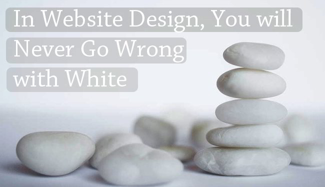
In Website Design, You will Never Go Wrong with White
Of all the colors to choose from in creating website design, why use white? Color enthusiasts will surely say that white looks too plain or even boring. The color white actually signifies purity, cleanliness and simplicity. Some neutral colors carry the same attributes as white but are more subdued. When white is used, it makes other colors look prominent. For web designers, white means user friendliness since it is not hard on the eyes. Other reasons why white should be the dominant color of your website design will be discussed below.
What to Consider when Building an Education Website
The internet has become a powerful communication tool. When an individual requires information, the best source is usually the internet which makes a website an indispensable component of any business, particularly for an educational institution. For schools, having an education website allows them an online presence and a marvellous public relations tool that will appeal to students. However, without a clear goal, the website might not achieve the purpose for which it was developed. We would also recommend you to view the education WordPress themes in case you need a website building solutions.
Warning! Free Sport Flat Icons Set Here
First of all I would like thank Shawn from www.vecteezy.com for this incredible set of icons he generously provided for our readers. Now read on!