5 Tips for Structuring Your Business’s Homepage
Even if you have dozens of dedicated landing pages, even if most of your marketing efforts are focused on your blog posts, even if you prefer promoting product or service pages – your home page needs to shine. It needs to be designed, written, and laid out incredibly well.

Your homepage will often be the first point of contact with your brand. And when it’s not the first, it will almost certainly be a point of contact.
Your homepage is like your business card –you want it neat, appealing, well-written, informative, and helpful.
Here are our five tips to help you structure your homepage well.
Think in terms of cones
Homepages are meant to be designed like cones – wider on the top and narrower on the bottom.
Not literally, of course.
The top of your homepage needs to be the heaviest – it should be the most visually appealing and contain the most important information. There is a catch here, though, because this information needs to be presented with as little copy as possible. Visuals should dominate the top of your page, as opposed to copy.
The lower you go, the less you should focus on images, and more emphasis should be placed on copy.
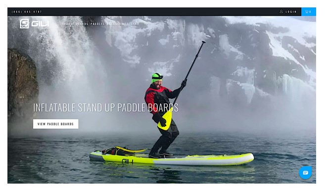
Here is an example to illustrate this point:

Source: gilisports.com
The Gili Sports homepage has only two elements above the fold: a hero image and a heading. This is literally all it needs – it shows the product and it tells visitors what the product is. As you scroll down, you get access to more images and more information. But the top of the page is all you really need to see to know if you even want to keep scrolling.
Make your headlines sharp
The headlines you use – although they don’t need to look like headlines on a blog post – need to convey your message well. Your best choice is always to focus on the pain points of your customers, as opposed to yourself. Your visitors don’t want to know what you do and how you do it – they want to know how you can help them.
Still, try to keep your headlines short and catchy – and don’t focus on over-optimizing them for certain keywords, but rather on the effect they will have on customers.
Here is an example from IconJar, who have done a great job at emphasizing all of their key features in different headlines: incidentally, they also use their keywords well, but that’s more thanks to the fact that their copy is written well.

Source: geticonjar.com
Features, benefits and other details
Even though we’ve just agreed you don’t need to focus on yourself, you still need to tell your audience how it is you will be helping them. This means you need to be very clear about your offer – what is it you do exactly?
Use your homepage to direct traffic to your service- or product-specific pages. If you only have one product, focus on explaining what it does and how, and outline and highlight some of your key features.
Don’t expect to be able to talk about everything on one page – clutter is not something you want people to see. Be as minimal as you can, and use powerful and descriptive words to showcase your top features, what some of the benefits of using your product or service are, and any other details you feel customers need to know.
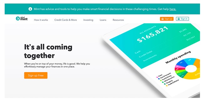
Here is Mint, which has a clean design and the major plot points neatly outlined: the brand clearly conveys what they offer, how it works, and why you should use their product.

Source: mint.com
Calls to Action and why they matter
Sometimes you need to nudge your leads into a conversion. But even if they are ready to convert on their own, you should never neglect your call to action.
They are here to not only inspire action, but also to provide a clear and simple way of converting – getting in touch with you via email, giving you a call, adding an item into their basket.
You can design different CTAs to fit with different levels of your sales funnel. Or you can direct all conversions in one direction, depending on how your sales cycle is set up, and what kinds of targets you are aiming for.
Place your primary and most prominent calls to action above the fold – at the widest part of the cone we’ve been discussing earlier.
Your secondary calls to action should be dispersed all across your homepage – as you never want to leave leads with only one chance of converting.
Social proof and proof of success
Finally, you want to include some proof on your website’s homepage – social and otherwise.
Social proof serves to showcase what others think of you and how you have previously helped others succeed. It should be carefully chosen and target the audience you want to encourage to convert. You can add different social proof variations to different pages. Your homepage, though, should contain the best of the best – your most prominent clients, your best reviews, etc.
You can also include proof of success on your homepage: the number of clients you’ve worked with, the number of projects you have resolved, the number of items you have sold, and so on. It will depend on your business and what you are selling – but try to be as unique as you can be.
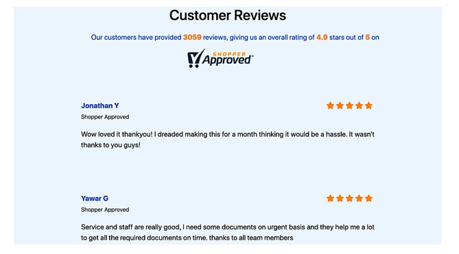
Here is a great example from My Company Works, who have added some badges and some reviews, and also let you check out what others have also said about them with some handy links.

Source: mycompanyworks.com
Final thoughts
Homepage design is not an easy feat – and should often be left to the very end, when you have already crafted all of your other pages. It’s also a good idea to A/B test your homepage until you find a formula that works well.
Lastly, don’t forget to think about the way your design meshes with your words and the way your copy blends with your images. All elements need to work together to provide the best possible user experience for your visitors.
