9 Examples of How to Use Calls to Action in Your Header
One of the best ways to increase conversions on your website is to make use of CTA buttons. Nonetheless, standard strategies, such as wording or design, won’t always be enough to get your visitors to turn into customers. Another thing to consider when going for higher click-through-rates is positioning.
Although a rare occurrence, adding a call to action in your header can be an excellent way to generate leads. Below, you will find nine examples of how to use calls to action in your header.
Know the benefits of a header position
One of the first steps in including a CTA button (or preferably buttons) on your website will be to determine the best possible position for your needs. For most companies, this will be a central, eye-catching placement. But there’s always room to use something a bit different.
Although a header CTA might not be the first thing your visitors see, putting it there is an excellent strategy – especially if you decide to use the right-hand corner of the page. Choosing this route, you’re placing your button among the most important information on your web. Plus, you’re making sure that it’s visible from every page on your website.
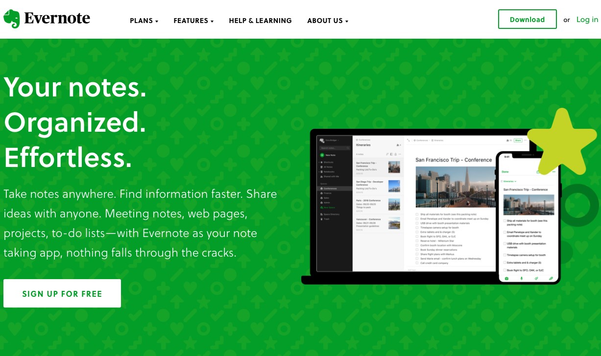
You will find plenty of great examples of CTAs in website headers, but one that works really well is that on the Evernote website. This company’s homepage is busy, so the CTA button uses a minimalistic design. Despite being simple, it still manages to stand out thanks to the rectangular border and use of color.
Use existing design features
If you’re worried about visibility, there are simple things you can do to make your CTA buttons stand out. The first is to use existing design elements, retaining a cohesive overall look, but directing your visitors’ eye towards the most important parts of the page.
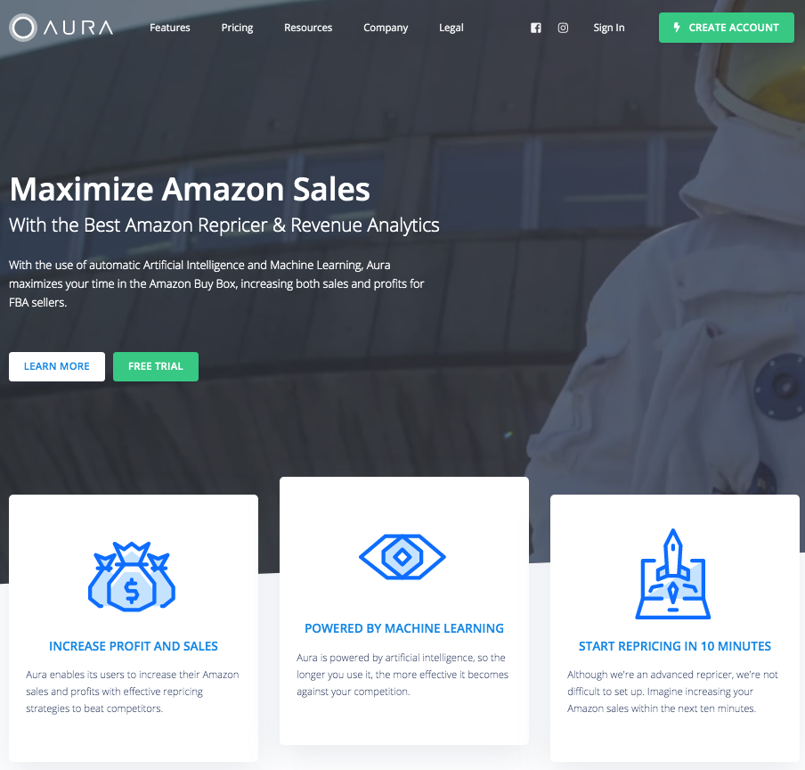
Color is an excellent example of such a strategy. As you can see from this example, the software company Aura succeeds in drawing attention to CTA buttons by using the color green. Even though the homepage is relatively busy, the header CTA is still the most prominent element, fulfilling its purpose in ensuring conversions.
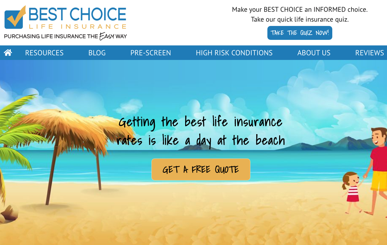
For a slightly different strategy, you can look at this website by Best Choice Life Insurance. Here, the header CTA stands out on a white background. Although wordy, it’s a great example of how to frame an element for maximum visibility.
Choose effective & convincing words
One of the main rules of designing great CTA buttons is to use language that inspires web visitors to take action. This can be done by using actionable words such as: get, join, start, and learn. A way to make these even more compelling is to add a sense of urgency. You can do this by using words such as now, free, here, or today.
Although these practices are pretty standard, you will find that a header position does not grant much space. This means that you need to make your top-of-page CTAs especially compelling. Though not rocket science, it will require some consideration on your part.
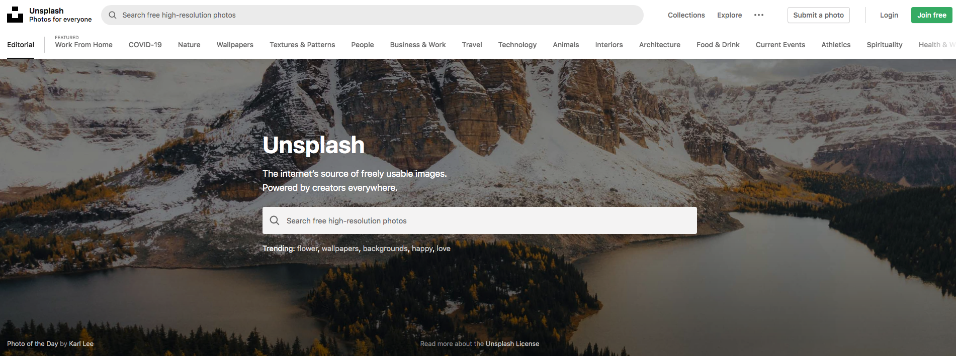
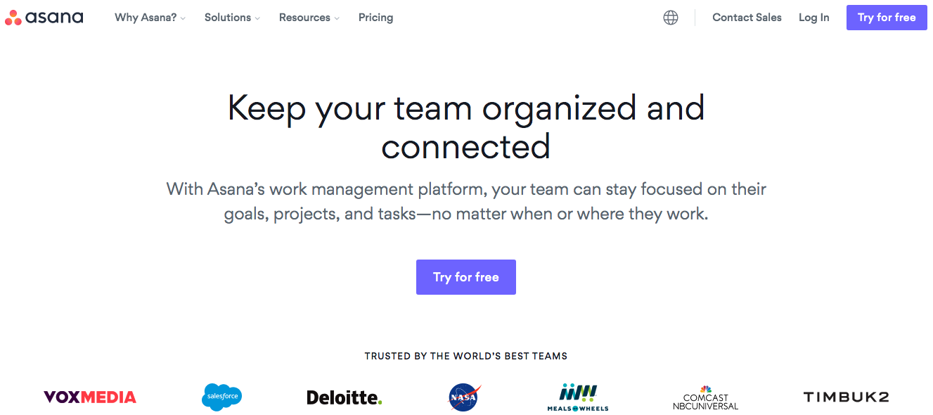
For some websites, the best way to use the position will be to point out the one fact most people like hearing: that a certain service is free. You can see this on websites such as Unsplash or Asana.
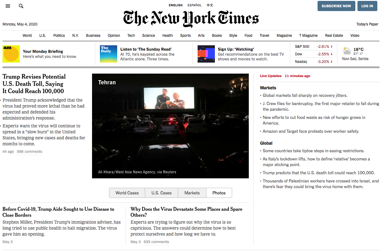
Other subscription services (like The New York Times) take the urgency approach, spurring visitors to make a purchase right away. If what you’re offering is a service, then considering a free trial period and marketing it through your CTA buttons is definitely one of the things you should adopt today.
Point out your strengths
If there’s something your company does particularly well, you can use it in your CTAs to generate leads and encourage sales. And yes, you can do this even if the feature is somewhat complicated.
Customer service can be a great feature to point out through calls to action. Whether you offer guidance or training on how to use your products or simply offer 24/7 support, you can use a header button to point this out.
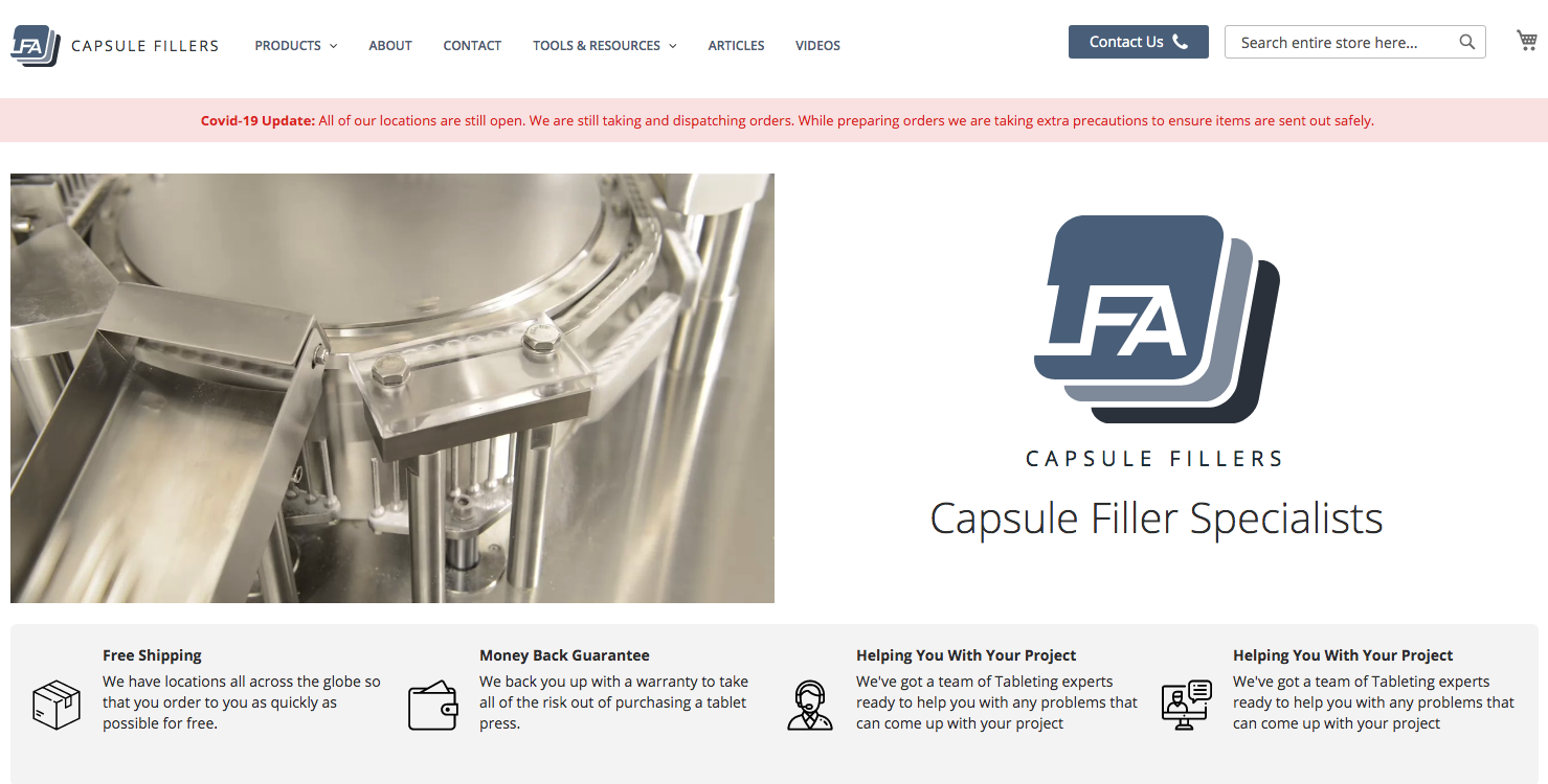
Learning from the example of LFA Capsule Fillers, you can use advanced browser functionality to do this. Their header CTA button simply states Contact Us, and clicking on it prompts the user to make the call through their device. This is an excellent tactic, considering that they’re connecting potential customers to trained operators, who can then use their sales skills more effectively than relying on the customer to make the decision on their own.
Create a sense of exclusivity
Often you’ll find that the most effective sales strategy is to generate a sense of exclusivity. It’s a well-known fact that emotions sell better than words, and luxurious goods (or services) can very much awaken an emotional response. So, if you’ve got an upgrade that offers more than the regular version, you would definitely do a good job of using a header CTA to advertise it.
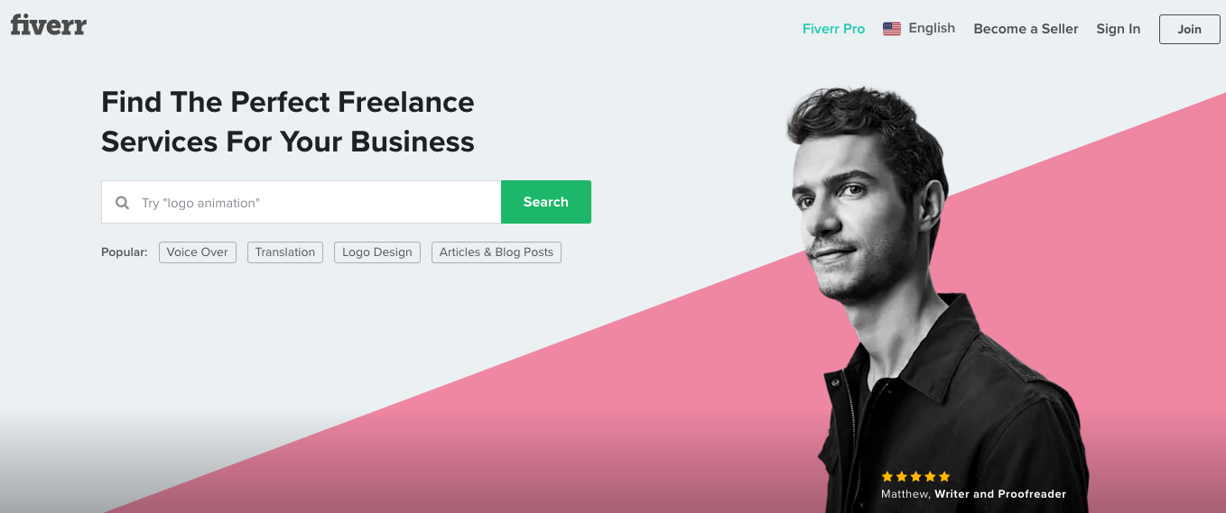
This is done particularly well by Fiverr, a freelance services website that simply points out that there is a Pro version of what they offer. The only way it’s differentiated from the regular service? Font color.
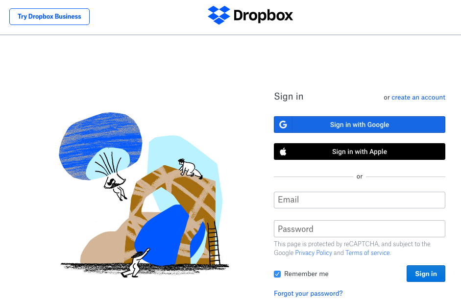
Dropbox does the exact same thing, using a Try Dropbox Business button to encourage potential users to choose the paid version of the services. And even though most users will still opt for the regular version of these apps, they’re more than likely to at least check out what the premium version offers, maximizing the seller’s chance of making an additional profit.
The takeaway about CTA buttons in your website header
If what you’re after is a way to increase conversions, generate leads, and make more sales on your websites, then you’ll need to pay close attention to how you use CTA buttons. While they can make a huge difference on your website, it’s still quite important that you thoroughly consider the features that will work best for you.
So, when adding a CTA button to your website’s header, here are a few things to remember:
- Make sure it’s visible by carefully choosing placement and design.
- Keep the wording short.
- Use language that encourages action and creates a sense of urgency.
- Point out your strengths.
- Draw attention to exclusive benefits and services.
- Don’t be afraid to experiment with interactive designs.
With a strong foundation set, all that’s left will be to keep a close eye on the analytics and make adjustments accordingly.
