6 Design Tips for Attractive Product Collection Pages
When it comes to designing a great e-commerce website, there are lots of things to think about. Choosing a template that looks great and is optimized for conversions can be a tough task. Especially when you’ve got a wide variety of products, and you want to make sure all of them have a chance to stand out.

But, the good news is that there are simple and effective ways to get around this challenge. Product collection pages allow you to group your offer based on the criteria that your visitors will find the most helpful. They can be as simple or detailed as you need them to be and can be a great way to add structure to your e-commerce store.
Nonetheless, mere functionality isn’t enough to get your sales up, so here are a few design tips to create the most attractive product collection pages.
Find a balance between information and simplicity
An attractive product collection page should speak for itself. Copy that is too long or poorly written puts you at risk of losing customers, so make sure that you’re using it as effectively as possible.
Yet, some types of products require more than a few words to make sense. If that’s the case with your store, your biggest task will be finding a balance.
Try to ensure your product collection pages look clean while providing all the necessary info. For an excellent example, take a look at this page on Nin-Nin-Game.com promoting anime figures. For those who know exactly what they’re looking for, it’s straightforward, giving them the option to get straight to the point and order their desired product. However, for website visitors who require more information regarding Nendoroid products, there’s a “More” button that lets them read in detail about what they can expect from these figurines.

Use stunning visuals
You’re probably aware of the importance of high-quality pictures on your website. But when it comes to collection pages, you should consider taking things a step further.
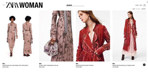
If your store features many products, taking the time to choose and combine images can do much more than show items off. It can help you tell a story or create a feeling of exclusivity. Fashion brands tend to do this particularly well by combining classic white-background images with those showing the garments in context. If you’re ready to do the work, you can even use GIFs like Zara, which will give your store a more palpable feel that will encourage familiarity and thus increase the chances of making a sale.
Take things further than the basics
When creating product collection pages for highly-specialized products, it’s a good idea to show more than just a picture and a price. Customers who know exactly what they’re looking for will tend to prioritize sellers who let them get all the info they require by just skimming.
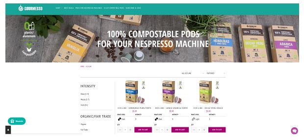
In these cases, you can choose to include a bit more than the mere basics in your quick product descriptions. For example, this compostable coffee pod page on Gourmesso’s website gives visitors info regarding the roast level and intensity of each blend. This way, connoisseurs can choose to take a look only at those products that pique their interest, thus minimizing the chances of them becoming fatigued and leaving without making a conversion.
Another great example of using this strategy comes from the accommodation booking giant Airbnb. On the website, listings are presented with an image and price, as well as information regarding the number of bedrooms, beds, bathrooms, and the maximum number of guests who can stay at an apartment/room.
Make the best of social proof
If you’re selling more than one product in a certain category, making use of social proof could be the way to go. In terms of design, this type of feature doesn’t require too much work but can make a huge difference when it comes to conversions.
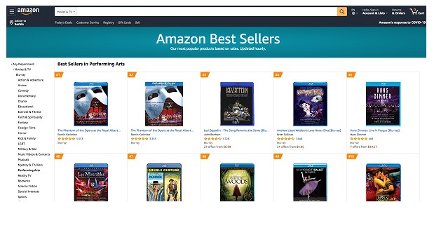
No other online store shows the power of social proof better than Amazon. Each listing on the shopping platform allows potential buyers to easily see the number of reviews an item has, as well as a visualization of the item’s rating in stars.
The great news is that asking your customers to leave a review is something you should be doing anyway. You can showcase the feedback on your homepage, product, or collection pages, but also use it to improve your service or identify the strengths you didn’t know you held.
Direct attention with eye-catching tags
Some e-commerce stores don’t have the advantage of exciting product photos. If product appearance or packaging isn’t working in your favor, you can include elements that will.
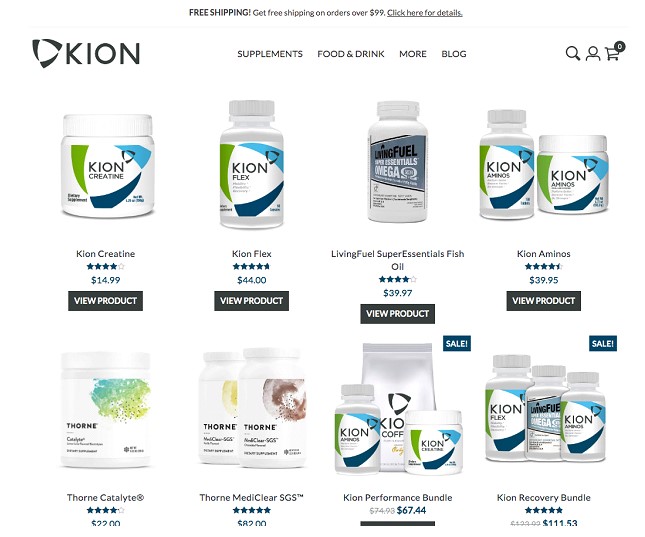
Tags for deals and products on sale can not only be used as a signal for users to pay attention to an item but even more, can help create a sense of urgency which has been shown to drive sales time and again.
The great thing about this strategy is that it can work with absolutely any website design, regardless how simple or intricate. Just make sure you use fonts and colors that are in line with the rest of the website and that there’s room for the sign to stand out. For an example of a web page that gets it right, take a look at Kion – a website that only uses two colors in its design, yet still manages to grab the visitor’s attention.
Make product collection pages easy to navigate
Last but not least, it’s important to keep in mind that collection pages hold great promise as long as you make them easy to use. No matter how well you showcase your products, it won’t matter if your website visitors need to take numerous unnecessary steps to browse the rest of your website.
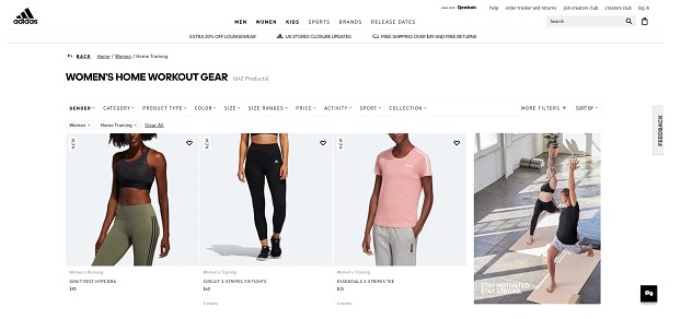
This is why your navigation menu needs to be clear, concise, and designed with exceptional user experience in mind. A brand that does this quite well is Adidas, where getting to a different category can take as little as two clicks. If you prefer something a bit less minimalistic, you can use a navigation sidebar such as the ones found on websites mentioned earlier in this article.
Final thoughts
Getting the most out of your website isn’t always easy. It takes lots of work and even more testing. Nonetheless, making conversions should not be that difficult as long as you do two things right. Firstly, choose a design template that allows your products and services to stand out. And secondly, don’t be afraid of making changes or experimenting. You’ll find plenty of great advice on how to create leads, decrease bounce rates, or increase loading speeds – but focusing on the basics should always be the place to start.
