Visual Hierarchy – Everything You Need to Know
Apart from fancy graphics and catchy text, a website must take into account size, colors, composition, what to include and what to leave out. Unless you understand how visual hierarchy works on the Web, your website design won’t be as effective. Visual hierarchy consists not just of aesthetics, but also of principles that a website must use.
The most essential components of a good visual hierarchy structure are layout, pattern, color, size, contrast and proximity. There are many ways to implement them, but those principles must always be taken into consideration.
Why Patterns?
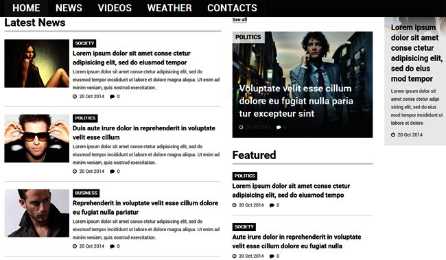
A pattern or repetition is crucial because it stresses the importance of the element, and it also makes it easier for the user to relate the items. For instance, online news sites use similar paragraph styles for their significant reports so that by merely looking at them the message is conveyed clearly: this is important.
This is true not just for paragraphs but also website headings and subheadings and links. Simply put, these patterns create a sense of familiarity and offer visual clues to the user as to their content.
Layout
The layout or alignment of elements is critical, as it tells the user where to find what. Web layouts can be done in different ways, but the one constant is that vital information must be at the top of the page. Another element of a good layout is the presence of a menu or navigation bar at the top or to the left. In short, you need to use these two elements in your layout to make it easier for the user to find what they’re looking for.
Proximity
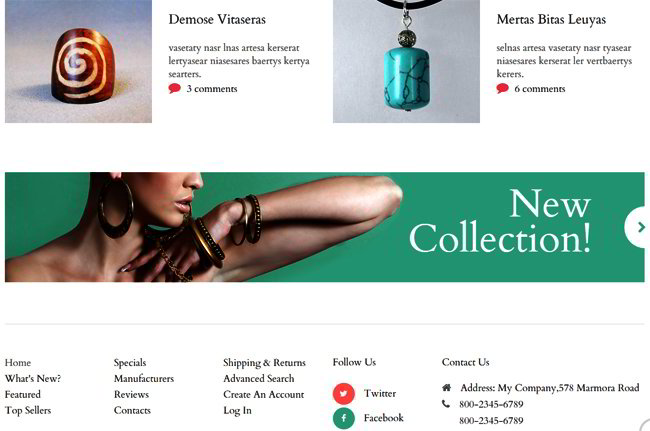
Proximity refers to the way elements are clustered together on the site, but it can also refer to the separations or hierarchies within the structure. There are many ways this can be done, but an example would be a blog with sidebars that has headings, paragraphs and titles. This has a specific purpose, and that is to show that they are part of the hierarchical subgroup on the page.
Contrast
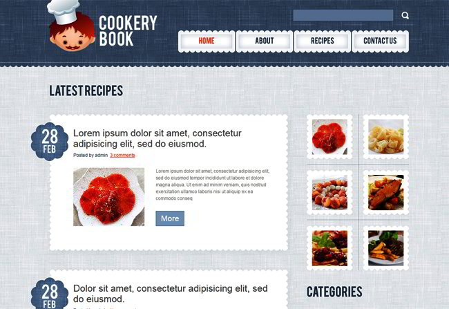
Contrast can be used to great effect and for signaling a change in the tone. For instance, if one part has a light section and the next is dark, it sends out the message that this is important and naturally draws the user’s eyes to it. There are different ways to make elements in a visual hierarchy stand out, and one of them is to use color.
Color
You use color to bring the user’s attention to specific parts of the site. A vivid color may be used to make an element stand out from the more subdued hues around it, and the reverse can also be done. Color schemes can be arranged in different ways so you’ll need to experiment and try different approaches.
Size Matters
There’s a reason why newspapers type headlines in big letters, and that’s to draw attention. This is true for website visual hierarchy as well. The rule is very simple: the more important the element is, the bigger it should be. The opposite also needs to be true, in that less important aspects of the page have to be smaller.
It’s critical that you follow this rule because size, like color, serves as a visual cue telling the user what he / she should look at.
The Goals of Visual Hierarchy
Number one is to inform users. People will visit your website to find information about your product, service, brand etc., and if they can’t find it quickly enough they’ll move on to another site. That’s why the design must be such that it guides the user without getting in the way. A payment processor for example, must provide clear cut options along with CTAs (calls to action) without forcing the user to do anything.
Second, the hierarchy needs to present information in such a way that it corresponds with the way users prioritize. So if you have an online retail store, you can arrange items by categories followed by content in the center and more detailed classifications at the bottom.
Third, the hierarchical structure must connect with your visitors emotionally. If you’re selling cars, you must provide pictures, videos, specs, and create an ambiance that suits that of car owners and lovers.
Final Notes
Keep the background color subdued and make sure that it doesn’t distract the user from the content. It will also help to put icons here and there to act as guides, but do so only if they are necessary.
Finally, don’t forget about space. Websites don’t need to be full of images or crammed with content. Your users need space to absorb everything they see, so break paragraphs into small chunks and keep image sizes reasonable. This is true for color as well.

