What to Keep in Mind When Designing a Food Related Website
There are many types of websites related to food. Some are restaurant websites, from which you can find out about their menu choices. You may even be able to order food for delivery. Other websites offer recipes, while there are also websites dedicated to healthy food recommendations.
Regardless of the purpose, what these websites have in common is that they feature food. That’s something that will determine how the website will be designed to maximize the user experience. So what should you keep in mind when you’re designing a website that’s dedicated to food?

Here are some crucial tips to remember.
You Need Beautiful Pictures of Food
When you’re in a restaurant or in a kitchen the smell of food can already you’re your mind to imagine epicurean delights. Smell is a powerful mood enhancer. The smell of coffee alone is comfortable and warming. And the smell of fresh bread is truly enough to make you hungry.
But you can’t offer your website visitors to “smell” food. So you’re left with just the sense of sight to beguile your web visitors. The pictures of the food must be impressive. You have to compensate for the lack of aroma.

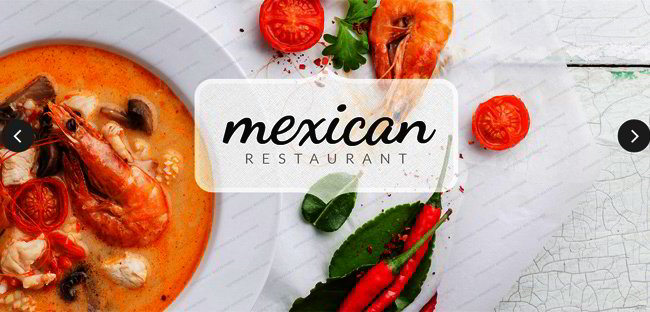
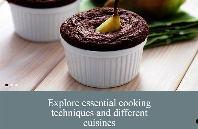
As a web designer, your first priority is to make sure that you get awesome pictures of the food. It must be well lit and placed in the finest bowls and plates. The color should really come to life, as if it’s somehow illuminated from within. You really want bright colors here, and you can also emphasize texture as well. That goes for the food and for the background.
What you don’t want are pictures that are dim, or as if the colors are mixed and muted. Such pictures may make it seem like the food has been left out for a few days. And you don’t want those kinds of pictures on your food website.
Your Menu Must Be Presented Nicely
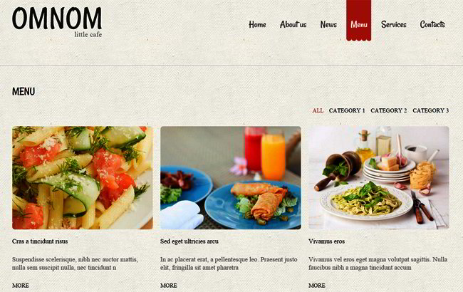
Too many websites of restaurants these days just scan their in-house menus and then publish these photos on their sites. This is the lazy way out, and it doesn’t really help website visitors all that much. Downloading a PDF of a menu is cumbersome and impractical. What you should do is to take advantage of the Internet and let website visitors navigate around separate web pages for different categories.
As a web designer, you need some sort of floating navigational tool to help your visitors move around the online menu. Perhaps you can offer a succession of options. For example:
• You can ask what kind of meal the visitor wants. This can be breakfast, lunch, or dinner.
• Then you can let them choose the kind of general dishes they are looking for. For example, you may offer a meat lover’s special, seafood specialities, or vegetarian dishes.
• Each group of options can then offer several specific dishes.
• Drink options should be offered as well.
If you have a website that offers recipes, then the same principle applies. You have categories grouping similar food items, and you should offer the steps with clarity and precision. Better yet, you can offer videos on how to prepare a certain dish.
All the Required Info Must Be Present
Text is also important when you use them to offer additional information to visitors. Unfortunately, here is where a lot of websites falter. They seem to think that they should just describe the food. As a result, it’s like the text was written by someone who used a thesaurus to find every synonym of the word delicious. Just how many times must a website visitor read that a dish is heavenly or delectable?
Nowadays, you need more solid info, because many people just want to know more.
Here’s a partial list of info you should include on your site:
• The name of the dish. When a dish has an exotic name, there should be a pronunciation guide as well. Quite a few people have been discouraged from making a call because they don’t know how to pronounce the name of a dish.
• The price. Here, if the website is for a restaurant then the price should be displayed for dine-in or delivery. If there are different sizes, then each size must have a separate price. If you have a general website, you can put in an estimate of how much the food will cost.
• The phone number and address of the restaurant. This allows visitors to make a reservation. But the website should also make clear if they offer delivery as well.
• The atmosphere. You also need a lot of pictures inside the restaurant. The atmosphere is one of the restaurant’s selling points, so people will know what to expect. The dress code should also be mentioned as well.
For websites with cooking tips and recipes, the information should include what tools to use for cooking. For more health based websites, the required info must also include a list of ingredients and calorie content.
When designing a website that focuses on food, keep in mind that eating is supposed to be a pleasure and a delight. And to reinforce that belief, the web design must be delightful as well.


