How to Use the Low Polygonal Technique in Your Web Design
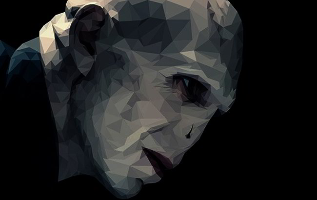
The low polygon look has become very popular in all forms of media these days including magazines, TV and the internet, where you see faceted, low detailed models and objects rendered with various lighting effects. The low polygon design is basically a reaction to the photo-realistic artistic movement and a throwback to the old pixelated days of computing, but with a contemporary twist.

Characteristics
Before explaining how it’s used and done, you need to understand that every 3D model is comprised of polygons, and the more polygons there are the more detailed the object will be. When the object is rendered, special techniques are used to give it a smooth, uniform appearance.
The low polygon look you see on websites uses less polygons so the image appears more abstract but still recognizable. When created with a 3D program, the rendering engine doesn’t smooth the image, but instead renders every facet, resulting in an angular, blocky look.
A low detailed image doesn’t mean low resolution however, as rendering methods, illustrating and lighting effects can add a lot of detail on the object so it manages to look realistic.
Using Low Poly Images on the Web
Low polygonal images and techniques work well online for many reasons. Since the image has fewer polygons, it doesn’t take a lot of time to model, render and animate, so it’s ideal for 3D interactive use. Second, there are web rendering engines available that make displaying of images and animation on browsers easy.

The best known of these technologies is WebGL, which enables 3D content to be displayed in your browser via JavaScript interaction. There are also several JavaScript frameworks built for this purpose like three.js so most of the complex work is already done. Alternatively you can use real-time Flash 3D engines to achieve the same goal. What makes WebGL an attractive option is it is open source, allowing you to rework the code to suit your needs.
How to Create a 3D Polygon Image with 3D Software
This example uses Cinema4D, but most 3D software have similar functions so you can use whatever you want.
1. Create an object using cubes, cones, pyramids, and other simple objects. Remember your goal is to make the object as simple as possible.
2. Edit the segments so the object surfaces are subdivided. The more segments you create the more facets there’ll be.
3. Turn the smoothing of the object off. In Cinema4D you change this in the phong properties, either by setting the angle to 0 degree or removing the phong tag.
4. Pull some of the nodes manually or with a deformer so the object doesn’t appear too symmetrical. You can also use a noise shader to randomly add displacement and noise on each vertex.
5. Add a bump map to give the object texture, or you can just leave the object as it is, depending on what you want it to look like. Add a background if you want.
6. Add some diffused soft lighting to the scene, and you can also use Ambient Occlusion for a grainy shadow.
7. Render the object and put it on your webpage.
Experiment with the lighting and textures until you achieve the look you want, as 3D software allows you to position lights in different ways until you get the look you want.
Illustrating Polygon Images
Even if you don’t have 3D software you can create low poly images with 2D illustration software like Illustrator or photo editing programs like Photoshop. These programs come with predefined basic geometrical shapes so you just need to arrange them to create the scene you want.

Once you’ve drawn the object, choose a light source location and add shading for that faceted appearance. You can also add lighting effects and textures to achieve the desired effect. Just like with a 3D program you may need to play around with the lighting and texture to find the right setting.
2D or 3D?
Some web designers prefer 3D while others like 2D, but it’s all a matter of personal preference, so feel free to try both. It’s not so much the method you use but the end results that matter. Just like with other images, you’ll need to use these properly to grab people’s attention.
Note: there are a lot of free 3D and 2D programs available for web design, so give those a try first. Many are full featured and rival those of commercial packages, and if it works, then there’s no reason to buy an expensive illustration or 3D program. Because of their unique appearance, polygonal images naturally grab people’s attention, so make sure that it contains the message you’re trying to convey. If the image is going to be the focal point of the page, arrange it in such a way that the background and surrounding design doesn’t get in the way, allowing the viewer’s eyes to focus.
