Web Design and Yellow Color
Why so gloomy and sad? Maybe it’s because you’re clicking on the wrong websites! You see, all those dark hues and glum colors can get to you, especially when you are exposed to them for an extended period of time. What you need is a little bit of cheerfulness, and that’s where the color yellow comes in.

Yellow is perhaps one of those website colors that will invariably cheer you up and make you smile. It’s what we use when we picture the sun, and we can’t help but feel revitalized and energetic in its presence. It’s warm and comfy too. It is the color of light-hearted exuberance and joy. It’s as if everything’s all right with the world and things are going to get even better.
Yet yellow can also be quite attention-grabbing, especially in contrast with drab and dark colors. In the urban setting, taxis are colored yellow to instantly get your attention, as it stands out in a field of brown and gray that’s typical of cities nowadays. It can also grab your attention because it’s a warning. Yellow on black, for example, is perhaps one of the most used color combinations for warning signs.
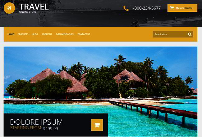
https://websitetemplates.org/web-templates-type/50710.html
When and How Should You Use Yellow in Website Design?
If you are contemplating a particular website template with yellow as its predominant color, here are some ways which you can use the yellow element
• Use it as your predominant color if you are promoting something that’s connected with children’s products and activities. The yellow’s light-hearted cheeriness is ideal for this. It’s the same thing when you are promoting something that’s leisurely, entertaining and pleasant. It projects the feeling of spontaneity and energy that’s almost childlike and innocent.
• Use only the brightest and purest yellow on your website. If you are going to use yellow, you may as well embrace it fully. The brightest yellow fully emphasizes what the color is known for—a cheerful energy that’s very hard to ignore.
Darken it with shades of black or brown and it will look dingy and dirty, like something unwashed. It feels as if there’s been a mistake, and people will find it almost unsanitary. The darker shades can resemble dirt and rust and similar things that don’t feel like everything’s alright. Mix too much white on the yellow to make it lighter and it looks somewhat drawn and sickly. It resembles an unhealthy pallor, like a person that hasn’t been eating healthy foods and not getting enough sun.
• You can also use it to highlight a particular element in your webpage. This is the taxi principle at work—in a sea of different colors, yellow will really stand out and get your audience’s attention. People’s eyes naturally gravitate towards it.
• Make sure that you use a darker shade alongside it for contrast. If you’re using it for your text, then the background should be dark if you want it to be readable. And if yellow is your background, then the text should be dark. Do not use it if you want to project wisdom, elegance, and maturity. Yellow, is perhaps one of the most un-serious colors of them all, and if you are featuring topics of the utmost importance, yellow is not for you. It is the very opposite of luxury and So if your website is promoting luxury items that are priced much higher than its competitors, then you should avoid yellow. Yellow doesn’t connote expensive items—just the opposite, in act.
Yellow is also something to avoid if the topic under discussion is somber or very serious. If the topic doesn’t make you smile, then yellow is not for you. That goes for websites that discuss medical conditions, serious political issues, and financial With a yellow background, of course you will want to use darker colors for your fonts to make it readable. But that’s not enough. You may want to focus on sans serif fonts, because these are more modern and youthful. Serif fonts can be a bit stodgy and traditional, and it can clash with the youthfulness and exuberance of the yellow background. Use it with playful fonts and graphics, and you have the ideal website design for an audience that’s young or young at heart.
The Liveliness of Yellow
So if you are contemplating on using yellow for your website, the entire point is that you want things to be livelier, not somber. You want people to smile and have fun when browsing through your pages, not serious and grim. You can use it as text or background to truly highlight your page, as long as you remember to use it with darker colors for an arresting effect.
Remember, yellow denotes cheerfulness. If that’s the purpose of your website, then yellow is the perfect choice for you.


