Why Use Blue in Web Design?
Color is one of the most crucial elements in any website template. This is especially true if you have a commercial purpose, and you want to attract as many people as possible. Color appeals to others, and it can denote a feeling and mood much more effectively in some ways than just mere text.
When it comes to the popularity of colors, blue is perhaps in a very different category. It is the favorite color of more than 50% of the world’s population.
In most cultures, it is also the least hated color of them all. It’s that combination of most popular and least disliked that makes it the common choice of many websites. People of all ages love blue. It’s also not gender-specific at all, as it is loved by both men and women. Perhaps that’s because some shades of blue can be quite peaceful and calming. But the love for blue is not equal among both genders, because while blue is popular with women it is extremely popular with men. Maybe that’s because other shades of blue denote the intelligence and security that we often associate with authority. Blue conveys confidence, stability and importance, yet it doesn’t look somber or intimidating.
So Why Use Blue in Your Web Design?
If you are looking for a website template with a predominant color, starting with blue can be a very good idea. Here’s why.
You can’t go wrong with a color that’s the favorite of half the world’s population, and the least likely to turn off your website visitors. There is no divided opinion on blue, as everyone seems to like it, to some degree.
Since men are overwhelmingly approving for blue, you can’t go wrong with using it if you are promoting masculine products on your website. The websites of large companies use blue, especially in companies in the hi-tech
Websites for women can also use blue because of its very tranquil feeling. It’s a color that women love too, and by using it you don’t necessarily alienate the male side of the population unlike when you use overly feminine colors such
There’s also the sense freedom and the outdoors that are associated with the color blue. It feels unconstrained, and maybe that’s because blue is the color of the sky and the ocean. In a sense this can be very exhilarating, as the freedom it implies can lead to lighthearted joy.
Blue: Different Shades and Color Combos
When you use blue for your web design, you need to realize that different shades and color combinations can impart particular connotations.
Royal blue. This is a darker blue with a slight hint of purple. It looks quite regal and elegant, and it imparts a certain feeling of discreet, aloof superiority. It’s very luxurious as well. There is a certain superiority here, so to avoid dissonance you need to make sure that you are aiming to be one of the best websites in your niche.
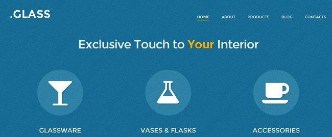
Pale or light blue. This is a very calming shade, and it projects serenity and wellness. It’s the color of the sky on a bright sunny day, or the color of the ocean while you’re on the beach. For websites who want to make their visitors feel relaxed, then this is the hue you want. Great examples of such layouts you can observe in the interior design WordPress themes.
Dark blue. Many corporate websites use this color for effect, and undeniably the effect is quite effective. It projects stability and authority and even masculinity. The color implies that the people associated with the website are serious, knowledgeable, and skilled. If you want people to trust your business, this is the color you want.Use this color if your business values determination and purpose. This is the color that works for people who take things seriously, and who promises to make everything better.
Blue with pastel. This is the color combination of spring, and it really looks fresh on a website. It’s as if your visitor will breathe better, and everything feels light and airy. It’s a welcome contrast to everything that’s dull, colorless, and dreary. If your niche or products are lighthearted, playful, leisurely, or entertaining, you can use blue with pastel colors effectively. This color combo can really appeal to the younger demographic.
Blue with metallic gray or silver. When you’re pitching techie stuff, this is the color palette you want. It’s very sleek and modern. So are you featuring the latest in electronics? Computer stuff, TVs, consoles, audio equipment, complicated machinery—all these loom great when paired with this blue with silver or gray combo. It’s very forward-looking, and the cleanliness of the look is quite striking.
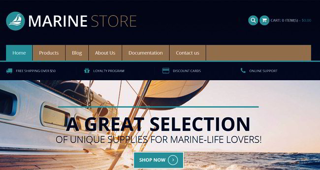
Blue and brown shades. It reminds your visitors of the wonderful outdoors, with the blue denoting the sky and the brown (or tan or beige) symbolizing our land. This makes it perfect for outdoorsy websites. An environmental website can differentiate itself from the others by using this combo, or by incorporating it with the color green.
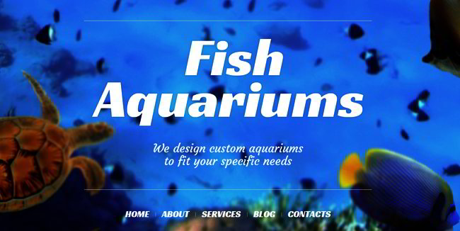
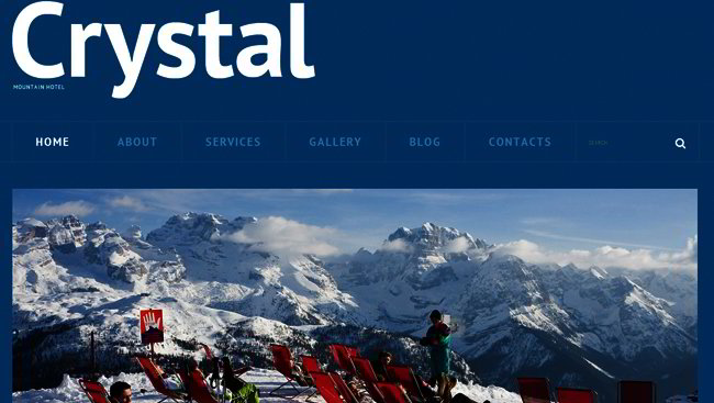
Here are some beautiful examples of blue in web design from our templates store:

