10 Deadly Web Design Mistakes
Some people think that web design is easy. They couldn’t be more wrong. This is why there are so many ineffectual websites out there, as well as too many websites that seem to look too much alike. Doing it yourself is fine when it’s just a hobby and you just want to set up a simple blog. But if it’s a serious website for a serious purpose, then you have to take web design seriously. Web design is complicated, which is why even some professionals make mistakes.
Sometimes these mistakes can be really deadly, and even just one false step can wreck the whole website. Here are some mistakes which you should be wary about.

Inadequate involvement in the planning stage.
Most beginner web designers operate using a very basic process. They talk to the client, find out what they want and need, and they try to provide it. Essentially, it’s just a two-way communication between the designer and the client. But some folks who will be involved later ought to be involved right at the planning stage. For example, the content writers should be on board right away. For business websites, the marketing people’s input should also be heard. This way, everyone’s on the same page and in sync with one another.
Having no idea of what the website visitors want.
Some clients focus too much on what they want. But the website isn’t really for them, is it? The website is actually for their visitors to use. There are those who do make an effort to try and see things from their visitor’s perspective. But they just imagine and assume what these visitors want. What’s really needed here is research, so that you know what they want.
Too much emphasis on speed.
Then there are some clients who want things done yesterday. And that’s always going to be a problem. When you try to do things quickly, mistakes are bound to occur. It’s not that there shouldn’t be a deadline or a schedule of some sort. It’s just that the deadline should be reasonable. The #1 priority should always be the quality of the website, and not how quickly you can get the website going.
Not enough emphasis on speed.
In this case we are talking about the loading speed of the webpage. There are lots of research studies on the topic, and the undeniable conclusion is that people want pages to load quickly. When it takes more than a few seconds, visitors just tend to give up on it.
Forgetting the fundamentals.

When you build a home, you start with a good foundation. You build from the bottom up. But some designers are guilty of thinking about putting in lots of new and creative touches first before thinking about the basics. That means the basics will have to be modified to conform to the new features. The basics, such as readable fonts, the right use of white space, and convenient navigation design, must always come first. Only then should additional features be included.
Design overkill.
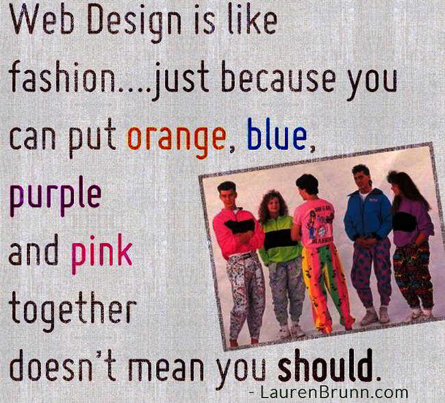
Just because you can add a lot of new features doesn’t mean you should add all of them. And just because there are hot new trends doesn’t mean that you have to incorporate them all. You have to focus on what the main point of the webpage is, such as providing information, amusing the visitor, or enabling them to buy something. All the features you include must not distract from this main objective.
Excessive emphasis on SEO tricks.
The guiding principle of traditional SEO is that Google employees don’t actually visit web pages to evaluate them. It’s done automatically, and so SEO experts put in SEO tricks like the right keywords and putting in links. But the design must focus on keeping your human visitors happy. Ironically, this is what Google wants you to do. When you keep your visitors staying longer on your website, then that actually helps your SEO.
Inability to emotionally connect with website visitors.
There’s this tendency in some websites to adhere to a “just the facts, ma’am” philosophy. This is the encyclopedia approach that doesn’t really work nowadays. There should be some emotional connection, and social networking features figures largely here.
Using the wrong imagery.

You need to pick your images analytically. Each image must be high-quality, memorable, and useful. Even the look of a block of text should be considered. The info should be easy to scan, so that people who don’t want to read the entire thing can get the info they want at a glance.
Unclear call to action.
In the end, when you put up a website you also want your visitors to do something. For ecommerce websites, it usually means you want your visitors to buy something, to register, or to join a mailing list. The website design must be clear on what you want your visitors to do. If you want them to click a button, for example, then that button must be prominent and placed in an obvious position. It should also be made clear what will happen when your visitor pushes that button.
If you are planning a serious website, then you really need to seriously consider hiring a professional or better yet – get a website template that is perfectly designed and ready to use. That way you don’t risk making any of the deadly mistakes we’ve listed here.
