An Easy Guide to Current Photography Website Design Trends
As any other trends web design trends come and go. You might have noticed that there are common trends that rule the web these days. For example – smaller businesses try to imitate the design aesthetic of such trend-setters like Apple in the hopes of getting an echo of that success. So let’s take a look at what current photography website design trends look like.

Minimalism
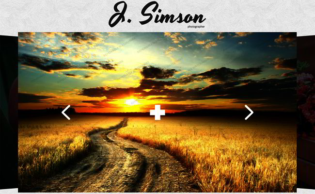
As a photographer you want your website visitors to pay attention to your photos. Thus the more stunning images you publish the better. But if your website layout is not that good you might loose the prospective clients. What is a good layout? Well, simply put – it is presenting images in an attractive but not overwhelming manner. One of the ways to do it is using an amazing photo as a background and having a panel of photos which can be easily scrolled. This minimalistic way of presenting your work really speaks volumes. Your prospective clients will see what you can do with a camera and won’t be overwhelmed with the website’s design and too many unnecessary features.
Social is a Must
Social is so in, these days everyone has a facebook profile, pinterest board and an instagram account. And everyone loves pictures! Photoblogs are easy to update (sometimes much easier than a static website) and they give more freedom to all parties involved. Your audience can contact you and speak their mind much easier and you can keep abreast and communicate with your audience in real time.
So, if you are a photographer looking to build a fan base and expanding your audience having a photoblog on Tumblr, Flickr, Pinterest and Instagram is a good idea. Another good idea is adding a link to your photoblogs to your photography website. Google loves social, your audience loves social, so it’s a win-win.
Contemporary Layouts
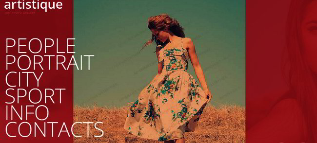
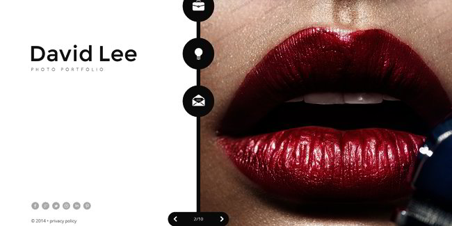
Gone are the days when a homepage had everything there is on the website with no concern to the use of space. More and more web designers implement horizontal panels or vertical navigation in photography web design. Galleries that look like scrapbooks are also very popular among photographers. These galleries give a more intimate, personal touch to the websites. This way the visitors feel a cozy atmosphere, they are at home and want to come back for more, and even book your services.
State-of-the-Art Typography
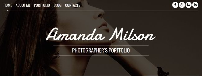
Choosing a unique typeface you create your brand identity and set your website apart from the competitors. Beautiful typography will make your online presence memorable. It is very easy to manipulate fonts if you are using a web template to create your photography website.
Choose your template now
So we discussed the latest trends in photography websites. But you are a photographer, not a web developer, right? Do not fret, we have your back! Every web template you see on this website is easy to customize and maintain, you do not need to have any special knowledge. Go on and choose among hundreds of beautiful and up-to-date web templates, the one that’s perfect for your photo website is among them, we are sure.
JavaScript Based Photography Web Template
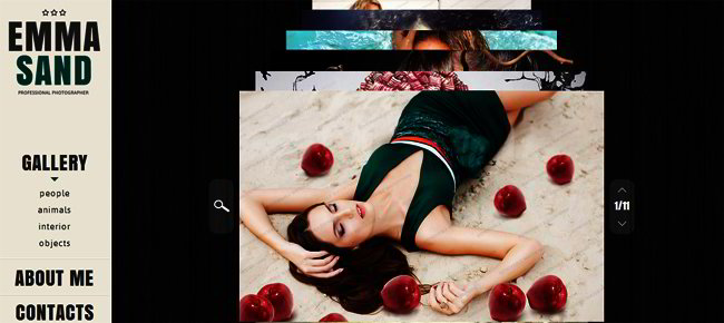
JavaScript Based Photography Website Template

JavaScript Photography Web Template
