Why are so many websites featuring fixed header bars?
Whilst browsing the web, you may have noticed that many of your favourite websites have started using fixed header bars. Why you may ask? Well, fixed header bars actually provide users with a number of benefits which we are going to explain to you in this article.

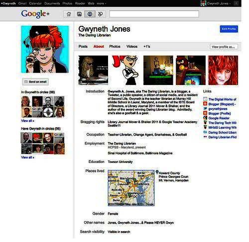
Some of the most popular social media websites like Google Plus use fixed headers so that their users can easily navigate to other pages.
What is a fixed header bar?
A fixed header bar is a website header bar that has been stapled to the top of the screen. No matter how far down a web page you scroll, the header bar will always be in sight. To make your website’s header bar fixed, you will need to use CSS coding, a good reference for the CSS required can be found here. Fixed header bars have become very popular with website owners as they keep navigation and website branding in easy reach for the user.
Quick and simple navigation
It is essential that website owners provide their users with straightforward navigation. The navigational elements of their website must be easy for users to understand, or they will simply find an alternative website that is easier to use. Fixed header bars prevent users from having to scroll up to the top of the page to click onto another page. They save a lot of time and allow users to access the information they need much quicker. Giving users more control and providing speedier navigation creates an overall better website experience.
Drawing attention to the website branding
Using a fixed header bar also enables companies to keep their logo, brand name and contact information in front of users at all times. The more users see the logo, the more memorable it will become, enabling them to recognise it when they see it elsewhere. Logos that are memorable help to build up consumers’ trust, which is a must-have when it comes to selling products online.
Viewing issues caused by fixed header bars
The only real complaint website owners with fixed header bars receive is that the header bar covers up too much of the screen when users are trying to view the website. This sometimes happens when a website is being viewed on a smaller device like a tablet or smartphone. There are a number of things you can do to prevent this from being a problem. First you may want to try keeping the header relatively thin. You only really need to include your logo and a few navigational links. There is no need to use drop down menus as this may cause frustration to the user if they accidentally hover over the navigation bar.
Alternatively, you could try disabling the header for certain devices, or give users the option to hide the fixed header. It is probably best to consult your web designer as they will be able to explain the possibilities of changing your fixed header bar for your specific website. It is important that you test out any changes you make to ensure that your website is still functioning correctly. It is best to try viewing your website on all types of devices, as this could prevent users from complaining or clicking off your website in the first place.

It is important to check that your fixed header does not affect how your website is viewed on tablets and smartphones.
Conclusion
Fixed header bars provide benefits for both the user and the website owner. They enable users to access the information they are searching for much quickly and help to improve the overall viewing experience. For the website owner, they help to draw attention to the branding, making it more recognisable to consumers. Although there are some problems associated with using fixed header bars, there are many solutions that can be explored to prevent them from causing distraction for users viewing websites on devices with smaller screen sizes.
