Mailing In Web Design – What You Should and Shouldn't Do in B2B Design
Web design and mail are two words you don’t hear together often. Yet even major postage and mail product manufacturers need to have websites. And ideally those websites should look nice. However, as you will see below not all do.
To demonstrate what does and does not work, Ian Wright from Expert Market US looks at 6 websites from the mailing industry. Websites will be judged on look and feel, speed, ease of navigation and finally how responsive they are on mobile devices.
After looking at these sites he will then give some general tips for B2B web design.
USPS.com
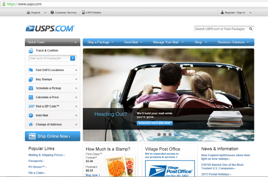
What better website to start with than the United States Postal Service site at USPS.com? This is their home website and is designed to be used by consumers looking for help with their personal mailing needs. Let’s look at it in three dimensions:
Look & Feel: The site looks professional with a navigation carousel taking up most of the home page. While not minimalist by any stretch of the imagination, it does have a clean feel to it.
Speed: According to Pingdom Tools the total page size is 1.3mb and loads in 893ms. Faster than 91% of tested websites. Not too shabby!
Navigation: The first thing you notice about the homepage is that there are a lot of navigation choices and it’s not always clear why things are where they are. That said you can generally get to where you want to go within 1-2 clicks. So while not perfect, it gets the job done.
Responsiveness: To test responsiveness I used screenqueri.es, which showed that the website does not dynamically resize when screen resolution changes. Thus, while the site looks good and is relatively easy to navigate on laptops and desktops, it’s not so easy to use on iPhones or smart phones.
Verdict: Overall, a nice looking website that just needs to invest a little more in responsive design to get an A+.
PB.com
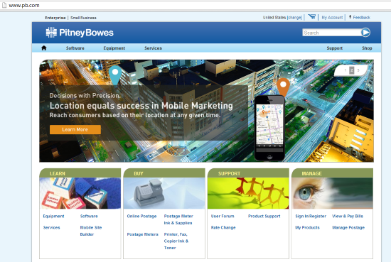
PB.com is not the website for peanut butter, but for Pitney Bowes the largest mailing room equipment supplier in the United States. A typical customer is likely a business user looking to buy one of their products.
Look & Feel: Feels much more basic than USPS.com. Has a carousel on the homepage but the rest of the site looks a little outdated.
Speed: While the website is only 675kb, it takes 2.78s to load. Not an enmity, but only faster than 55% of other websites.
Navigation: Navigation is OK, but could be better. Links to important areas of the site from the homepage, but finding exactly what you want takes a little digging.
Responsiveness: Website does not make use of any responsive design. Not too surprising considering USPS doesn’t either, still sites like this do so, so it shouldn’t be that difficult.
Verdict: A basic website that does get the job done, but looks a little outdated.
Neopost.com
Neopost is the world’s largest manufacturer of mailing equipment and their homepage reflects this fact. Instead of taking you directly to product pages you have to pick which country you live in.
Look & Feel: A relatively simple home page that is very obvious how you get to your country’s specific webpage. A clean but forgettable site.
Speed: Despite being relatively simple looking the Neopost homepage is 1.6mb and loads in 4.22s. This makes it faster than 37% of websites or slower than 63% of them.
Navigation: Navigation on the home page directs you to specific country page. However, other navigation options don’t automatically lead you a country specific page which makes some choices a little confusing. Should exclude products and solutions from home page and include them only on country specific pages.
Responsiveness: Like all the other websites we’ve looked at so far, Neopost.com does not make sure of responsive design. Again for a billion pound company this is somewhat surprising.
Verdict: The website does what’s supposed to do, but doesn’t really leave much of an impression. Slow speed and less than optimal navigation mean then website just gets a B grade.
Haslerinc.com
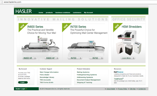
Haslerinc.com is now owned by Neopost. That said the two companies and websites continue to be run separately. Moreover, they could not be more different (OK, they could)
Look & Feel: Again, a basic design, but one that puts their products front and centre. Not going to win any design awards, but great for customers.
Speed: Tiny site at just 250kb (even with many product pictures) which clocks in at 688ms. This makes it faster than 94% of websites.
Navigation: Simple and straightforward, you can get to all products within two clicks of the homepage and most popular products within one. Great if you’re looking for equipment.
Responsiveness: The only thing this website doesn’t have going for it is responsive design. Given its small size, not a huge deal but it would make the whole page better.
Verdict: Simple and to the point. Not rocking the boat but gets the job done. Gets an A (rather than A+), because it doesn’t make use of responsive design.
FP-USA.com
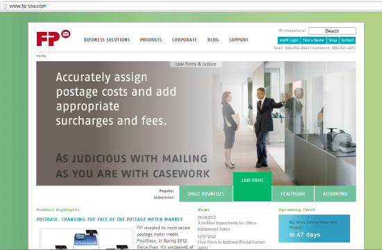
FP-USA.com is the website for FP Mailing Solutions, the American arm of German company Francotyp-Postalia.
Look & Feel: The first thing you notice when visit the site is the huge carousel on the homepage. While it looks nice, it makes navigation somewhat difficult. A large Facebook block doesn’t really improve the look and feel of the site.
Speed: The site is 1.1mb big and loads in 3.43s. This makes it about average for all websites.
Navigation: Dominated by the carousel, which means if what you’re looking for isn’t there, you have to scroll to find it. On the plus side does have links to major products below and above the carousel as well.
Responsiveness: Not responsive and the big carousel makes navigation that much more difficult.
Verdict: Could be nicer and a bit easier to use so gets a B-.
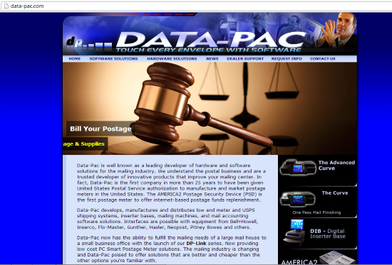
Data-Pac.com
Data Pac is The newest postage meter company authorized to manufacture in the United States and they have the most basic website.
Look & Feel: The ugliest of the sites on the list. It uses ugly graphics and color scheme. Not a pretty site.
Speed: Site is only 610kb big and loads quickly in 1.51s, faster than 80% of websites.
Navigation: Navigation is basic but easy to follow. One click to most products.
Responsiveness: Website is not responsive, which means you have to scroll if using a smaller mobile device.
Verdict: Given that the navigation works well it can’t be given a failing grade, but could be a whole lot nicer so we give it a C-.
General B2B Web Design Tips:
As the website above show there is a huge variety in the standard of web design being done in the mailing niche. This is similar to B2B websites in general, some are amazing, some are terrible and the vast majority are just meh?
Here are 5 easy things you can do to make your B2B site better:
1. Invest in a good web host. There is no point creating an amazing site if your server always crashes or website slows to a crawl.
2. Make sure you have a clear navigation structure. You want users to be able to find what they need to with no more than 2 clicks of their mouse.
3. Keep your website small. While the majority of people in the US now have broadband, not everyone does. Not to mention the fact that mobile users often have to pay for the amount of data they use. So spare your users and keep things as small as possible.
4. Hire someone who knows what they’re doing to build your website. So many websites were clearly made by amateurs, don’t fall into the trap. Your website should be viewed as an investment in your business.
5. Make your website responsive. This is probably one the things most B2B websites overlook. While the majority of users for most B2B sites are on a desktop or laptop computer not all are. And the numbers who are on Smartphones and iPads are increasing rapidly. Can you really afford to alienate 20-30% of your customers?

