How to Use Images to Minimize Bounce Rate
When it comes to your website, you don’t just want to get traffic (preferably organic, free traffic). You also want to keep your visitors on your pages long enough for them to convert. But that’s not how the internet works.
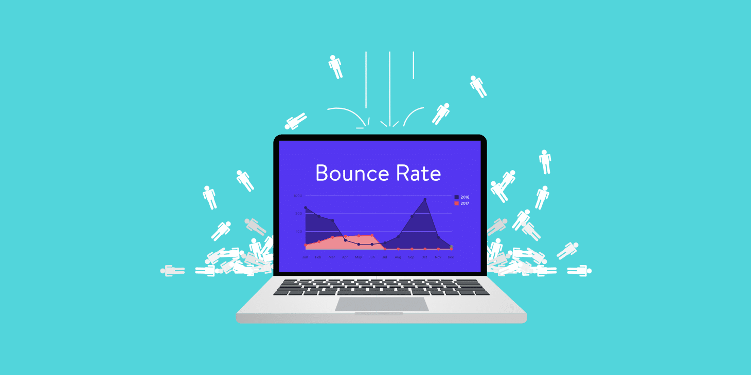
High bounce rates can often be an indicator that there’s something wrong with your web design. Low ones, on the other hand, might suggest you’re not implementing Google Analytics properly. In fact, the sweet spot for most websites would be to have a bounce rate between 25% and 40%, with averages for the majority of industries falling somewhere in the range of 55%.
So how can you minimize (or maximize) bounce rates based on what you’re trying to achieve?
Well, that takes work and effort, but you can start with the images you use on your website.
The exception: when is a high bounce rate acceptable?
Before you go about fixing something that’s working all right, you need to know when it’s OK to have a high bounce rate.
Single-page sessions are perfectly acceptable when it comes to content you’ve created to be informational.
Blog posts, info or contact pages, landing pages that direct to your Amazon product pages, etc., are all places where you want people to arrive, get what they’re looking for, and quickly convert. Here, you don’t need to be alarmed by high bounce rates. In fact, you should be looking at CTR rates and conversions instead, doing your best to ensure you capture information or make a sale.
However, if the links you want web visitors to follow are internal, then minimizing bounce rates is something you’ll want to focus on.
Cutting down on loading speeds
Image-heavy websites tend to have one thing going against them – page load speeds.
According to Google, a 10-second loading speed increases the probability of a bounce by 123%. Ideally, you want to keep the time it takes to show your content under 3 seconds. But that doesn’t have to mean cutting precious imagery out of your design. After all, the human brain prefers visuals over text.
What you should aim to do, however, is to choose the right formats and sizes. You can perform image optimization manually, or you can use a WordPress plugin such as Smush that will do this automatically.
Use images to make the most of viewing patterns
Here’s the deal: most people will only read about 20% of the content on your web pages. And faced with a big block of text, they may choose to close the window right away.
So, what you can do is use images to grab your readers’ attention and keep them on your website. But to place these pictures correctly, you need to keep in mind page viewing patterns. According to research, most people will tend to use the F-pattern when looking at online content, which means that their focal points will gravitate towards the upper left part of the screen.
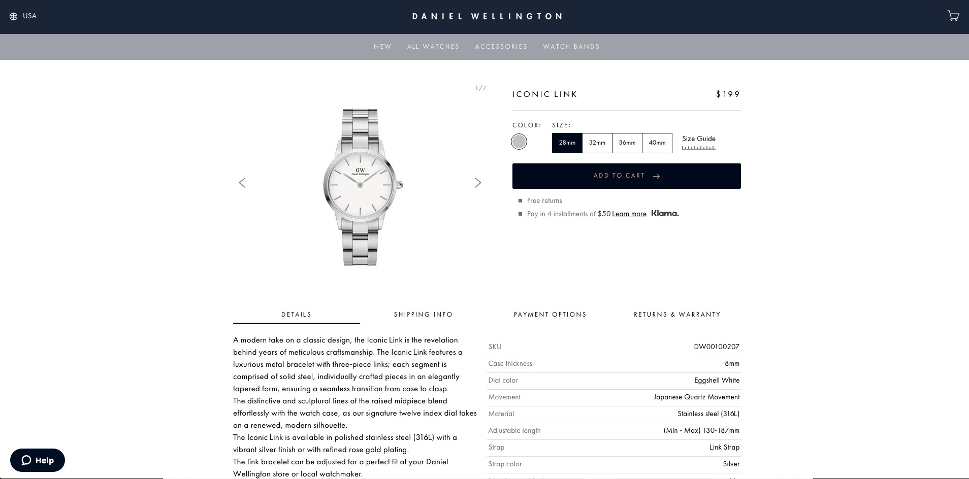
Daniel Wellington, a Swedish minimalist brand, makes the most of this information. If you look at their product pages, you’ll notice that the most prominent feature – the product image – takes the prime spot in the F-pattern. To its right are color and size choices, as well as the ADD TO CART button, while product descriptions inhabit less coveted spots.
This way, users can get the information they want, and almost instantly make up their minds whether they are ready to make a purchase or not.
Focus on UX
If you want to minimize bounce rates, you’ll need to improve user experience. And the right template can help a lot. That’s why you need to consider going with a minimalist design, especially when it comes to image-heavy websites and e-commerce.
Using too many elements tends to overwhelm the eye, making it impossible to find that one feature that needs to stand out. A clean background with a few well-placed visuals, however, can help you draw attention to the benefits of your products.
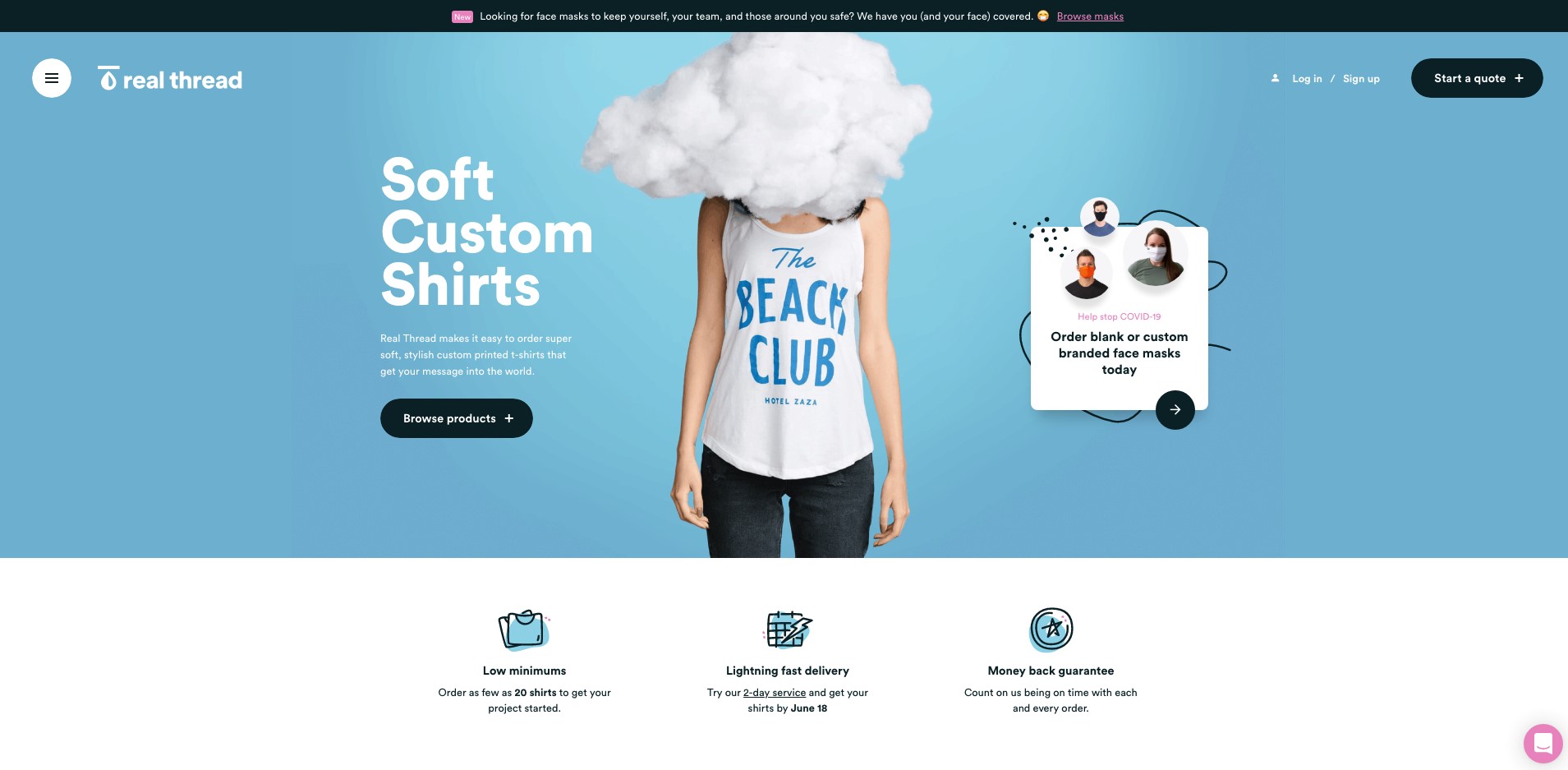
Of course, minimal doesn’t have to mean boring. Don’t be afraid to get creative with how you display your products. As you can see in this example by Real Thread, they chose a simple layout with a couple of well-designed icons, little text, and a unique way of showing off their specialty. Instead of opting for the tried and tested product image on a white background, they went with something a bit more different. It instantly engages the eye, while at the same time allowing the user to take in all the other vital pieces of information displayed on the page.
Actively direct attention
Most website designs rely on the user to choose where they look. However, leaving them undecided for too long can result in a bounce. You can avoid this pitfall by knowing where to place visual content.
On the whole, you should be aiming to put heavy-hitters at the top of your page. This is where you’ll place banners, navigation systems, CTA buttons, and anything else that you want people to click on. The same goes for images.
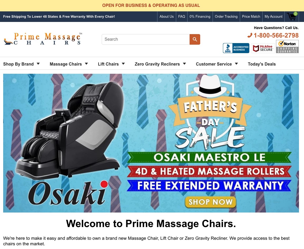
For example, if you’re running a sale, you need to make this instantly visible to anyone who lands on your website. And the best way of doing this is to update hero images to reflect current special offers. In the example below, you can see a seller who’s making the absolute most of the most prominent section of their website to call attention to a sale.
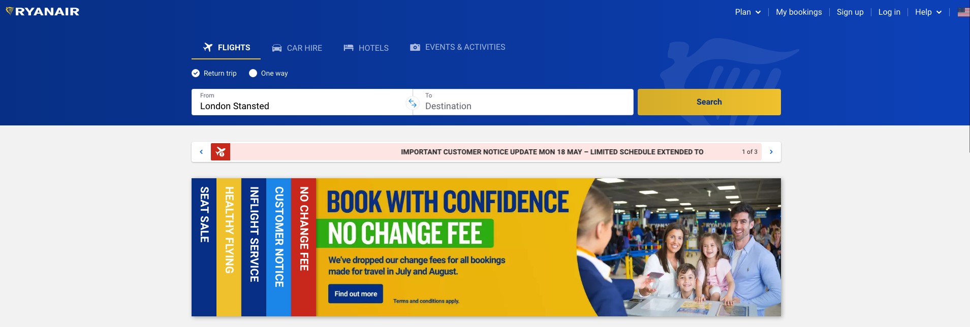
Alternatively, you can use visuals in this position to showcase important information, like Ryan Air did. Addressing the COVID-19 pandemic, they’ve chosen to waive flight change fees and to advertise this heavily in the section of their website that is guaranteed to be seen.
Don’t forget the importance of good content
Finally, if you’re experiencing high bounce rates, it’s not a bad idea to take a good look at the content you’re using on your website. Although you want your images to load quickly, you don’t want to make sacrifices in terms of quality.
Whether you’re writing a blog, shooting product images, or filming a video, always make sure that what you’re uploading is:
- relevant
- original
- optimized
- displays your products in a professional manner
- promotes your key selling points
- effectively manages expectations
The takeaway
While there are many ways to use images to minimize bounce rates, do keep in mind that what works for one website might not show equally good results for another.
That’s why you must keep a close eye on all your metrics, choose high-quality content, and of course, utilize A/B testing techniques to see what practices your target audience responds to best. This way, you’ll be making informed decisions that will help you take your business to the next level.
