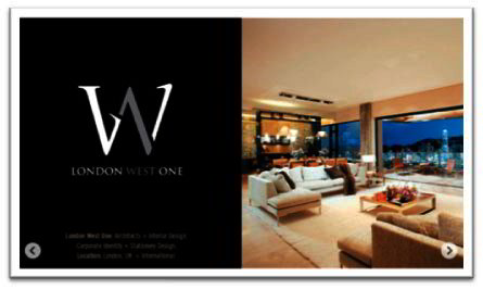
Top 5 Tips for Successful Logo Design
Successful Logo Design: Top Five Tips
Bring to mind some of the world’s most recognisable business logo design and you will find they all have one thing in common: simplicity. An effective logo needs to work in multiple situations, needs to carry the values of the company in one small graphic device and needs to be instantly memorable.
It’s a lot to ask of something so small!
Unfortunately, far too many people equate simple with easy. But that is certainly not the case when it comes to logo design. A good company logo will speak volumes; it’s not something you can buy off-the-peg. Whether you are designing a logo for yourself or for someone else, or even if you are commissioning a graphic designer to do the job for you, knowing what makes a logo work, what makes it successful and timeless, will help you to achieve that for yourself.
There is an awful lot to be taken into consideration in designing a logo but I’ve distilled it into five key points that will help set you on the right path.
1. Devise a strong graphic
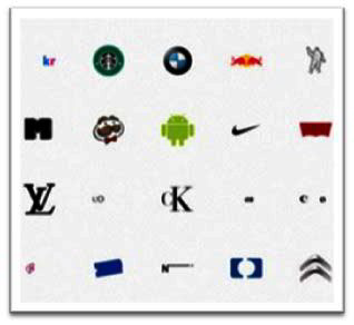
Successful logo design is one of the pinnacles of graphic design. Everything you need to know about the company must be distilled into a tiny pictogram. A logo that is devised merely from the company initials can tell you nothing about what the company does and while the best corporate logos are not necessarily simply pictures of the product, they do give a hint regarding the business the company is in. For example, the Nike swoosh says speed; the London Underground logo can be construed as the entrance of a tunnel.
2. Simplicity is key
Simple is easy to see and easy to recognise. A highly detailed logo with curly cursive script can get lost amidst the clamour of marketing messages that are vying for our attention these days. It is far easier for a simple image to stand out from the crowd. Once you have built up brand recognition, your customers’ eyes will have become trained to pick out your simple logo on a busy shelf in the supermarket – and remember, people like things that they recognise.
3. Can you super-size me?
Once your logo is launched into the big wide world it will need to feel equally at home as a thumbnail on somebody’s mobile phone screen or on the corner of a giant advertising hoarding on the side of the building. A simple graphic device is able to stand out even when it is at its smallest size; the same device can have strength and impact at a much greater scale, making its presence felt in a busy urban landscape. However, a highly detailed logo will be difficult for the eye to interpret when it is shrunk down to a thumbnail. So do yourself a favour and make it easy for your customers to see.
4. The dedicated follower of fashion?
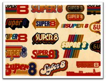
Don’t be! Just like everything else in the design world, there are fashion trends and fads when it comes to logos. One minute every single logo you see seems to be using the same typeface; the next minute every new logo to appear is a letter or a little symbol in a circle. But don’t be tempted down this road. At first they appear fresh and new and exciting. But then after a while that thrilling new design becomes ubiquitous and before you know it you’re bored with it. Devising a logo that fits the current look will suddenly leave you stranded with a logo that is past its sell by date. Nobody wants to look dated or as if they’re trying too hard, so find something that is unique to you regardless of what the rest of the market is doing.
5. Font matters
Your company may already have a house font that it uses for its name and if this is the case, then it makes sense to incorporate this font in your logo. However, if you have the freedom to choose a font for your company initials or strap line, then choose it with care. A fussy font with curlicues will be hard to read when it is shrunk down to its smallest size; and even when it’s larger, if you are using your logo on packaging or as part of an advertisement it is still likely to make the whole thing look overly busy. Likewise a very spindly font may be hard to read at different sizes. Choose one that is bold and simple, don’t use multiple fonts and steer clear of novelty fonts.
Above all, take your time and get feedback from people whose opinion you respect. If it’s your company logo, you might be living with it for 20 or 30 years. It pays to get it right.
Author:
Logo Design London is a professional logo design agency in London specialising in branding, graphic design, stationery design services and corporate slogans at http://www.logodesignlondon.co.uk/

