Web Layout Trends To Watch In 2015
If there’s one thing which is true about web design it’s that you need to keep updating your skills and knowledge of market trends if you hope to be competitive. As an industry web design has remained very much the same over the last few decades, but what customers both want and expect the typical web designer to be capable of delivering has changed quite a bit. In as much as some web designers stick to an almost-absolute formula when designing their sites (menu aligned left, cute header and some CSS tables, for example) if you look at designers on the cutting edge of web design you’ll notice they’re always taking chances and trying something new.

What I want to share with you today are our predictions for the major trends you can expect to see developing in 2015 – just so you can stay ahead of the curve without having to put in too much effort. Hopefully you’ll find some inspiration here too.
The Future Is Responsive
I’m sure that most people reading this understand just how important responsive design is, but might not understand that with the changes in how people are using the web that responsive design is going to become the accepted standard in online design in the very near future. If you’re looking for a trend to follow in 2015, and beyond, then get your head around responsive design and be ready to cater for any client needs in that regard.
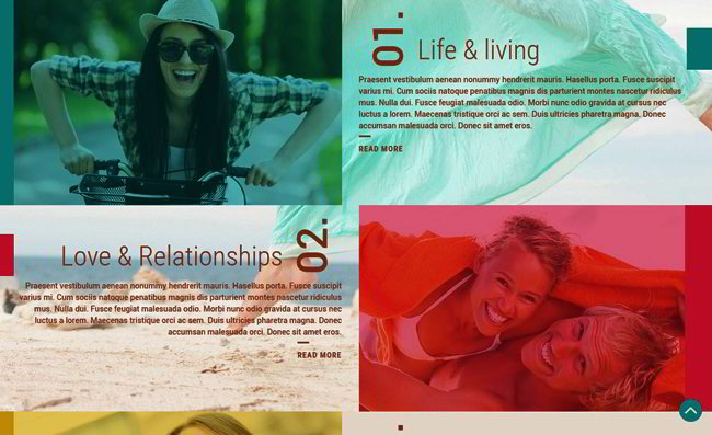
Split Screen Layout
This is more of an aesthetic request from clients than a shift in technology, but I thought it was becoming common enough to mention it here. It can sometimes be very difficult to capture the core messaging of a client’s web presence by just using a single image. But by splitting the screen horizontally you can present either complimentary or contrasting imagery or message on a client’s front page. How you got about splitting the screen is up to you, but once you start playing around with the idea I’m quietly confident you’ll be a convert to using it to approach site layout just a little differently in future.
Typography
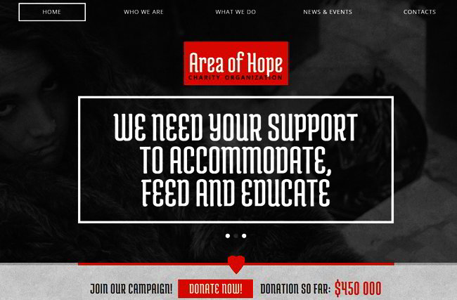
Web typography isn’t exactly new. In fact it’s the cornerstone of web publishing, but that still doesn’t stop thousands of web designers making silly, and avoidable, typography mistakes. The advent of web fonts – from Google and others – now means that you won’t be stuck using the same Arial/Helvetica combinations any more, giving you more space to flex your creative muscle. If nothing else make sure this is the year you refine your web typography skills because everyone else is going to be doing that too.
Scrolling Is in
Who remembers the days when you would do everything in your power to prevent users ever having to scroll down through a website? For years the demand was to minimize the amount of
scrolling visitors had to do, and instead make anything on the site accessible to them with just three clicks of their mouse. Guess what!? Now the demand is for sites designed purely around the idea of having visitors scroll through page after page of content. Some of the biggest brands on planet Earth are following this design trend, so you need to pay attention to it too.
As you can see there’s nothing really new under the sun in the trends above, with the exception of the split screen idea. Just continue to excel at the core principles which drive great web design, and you’ll shrug off your competitors and keep on impressing new and existing clients for years to come.


