Pastel Colors in Web Design
Pastel colors in web design used to be something of a novelty, but the past year has seen it become more prevalent, and the coming months will see this become a trend.
While most websites still use the primary colors, there are instances wherein pastel hues are better, and it will certainly make your website stand out from the rest.

Why Use Pastel Colors?
First of all, they’re easy to apply, and you don’t need advanced knowledge of color theory to put it to good use, not that having added knowledge will hurt, of course. Second, pastel colors have always been associated with elegance and sophistication, and unlike vivid colors, a website with light hues won’t “shout” at you, but come out as subdued.
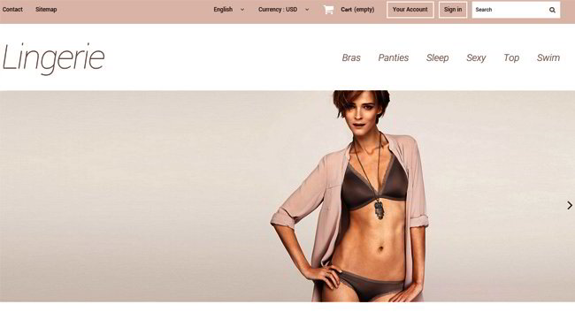
Websites that use pastel colors often have that minimalist approach whereby they use a washed-out color scheme, leading to a unified look that bespeaks purity. As it is, the trend is towards uncluttered websites with flat, muted colors, so it makes sense to add some light shades to your website.
A Clean Appearance
Take a look at a website with pastel colors, and the first thing that will come to your mind is the cleanliness and how refined it looks. This doesn’t happen by accident as the websites chose the colors from a color wheel and made sure that the end result was light and conveyed a feeling of space as it should be when using modern color schemes.
Multiple Design Options
The nice thing about pastel colors is they can be arranged in different ways, and you can use them to send a particular message about your website. Unlike loud, vivid colors, pastels are available in low or medium saturation, and the soft shade is easy on the eyes and doesn’t distract from the content.
Regardless of which pastel color you use, the effect will be the same, and it’s soft, neutral, and desaturated. Because the colors are washed out and hazy, it doesn’t have the bold, gaudy “noise” that solid, primary colors have. In short, pastel colors put the people visiting your website at ease, and you don’t strain their eyes either. This might not be something that web designers consider, but users looking for information on a page tend to get distracted or irritated by loud colors, so lighter shades are ideal.
There are many other reasons why it makes sense to use pastel colors. As stated earlier, it can make your website look different from the rest, and it helps with brand identification and establishing a presence. With your competition having their own website, it’s important that you distinguish yourself from them, so why not try something different?
Reaching Out to the Website Visitors
You only have a few seconds to create an impression on the person visiting your website, and one of the most powerful tools at your disposal is colors. With pastels, the feeling you convey is calmness, tranquillity, and comfort. It doesn’t matter if it’s a blog, a fashion website, or a pet store, as the emotional response will always be the same: warm and friendly, easy on the eyes as on the nerves.
The hues in a typical pastel scheme are limited, and it’s actually a good thing since the website doesn’t look like it’s drenched in colors and oversaturated. Even if the layout among these websites differs, the point is still the same, and it’s that they’re going for the soft minimalist look.
How to Apply Pastel Colors
Of course, this is a matter of personal preference on the part of the designer, but generally speaking, they’re best used on background colors and images, frames, fonts, icons, and logos. This doesn’t mean you should limit the application of pastels to these elements, but only that application there makes a huge difference in terms of the visual effect.
Pastel colors also work well if you’re after an elegant, vintage look that isn’t possible with other hues. Light colors are also suitable for websites with a retro design or that want to take a streamlined approach. Pastels can also be contrasted with one another, i.e., dark grey with two other light colors, or you can just go all light, the choice is yours.
There are some quarters that associate pastel colors with feminine elements, and there’s nothing wrong with this. Certainly, there are creamy colors that convey softness and lightness, widely accepted feminine traits. If you’re going to create a website that’s oriented towards females, using pastels certainly makes sense.
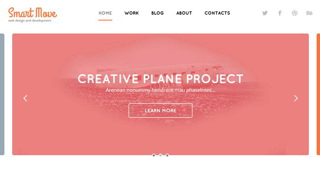
That being said, it doesn’t mean serious websites cannot use pastels, because business sites, design agencies, and others do use light shades. In some cases, the pastels are used in the background, but the point is they’re versatile enough to be applied in different ways, and with the right approach can even make the site’s color scheme look “cold”, which is apt in some cases.


