Hero Headers – New Trend in Web Design
There are a lot of new trends coming out that’s gotten web designers excited, but one that seems to have really caught our attention and likely to become a regular, is the hero header.
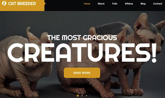
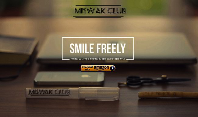
A hero header is defined as the use of an oversized image for the website, and as the header, it’s placed at the top of the website’s pages and when properly laid out, attracts attention.
How to Use Hero Headers
If you’ve never used a web hero header before you need to take a look at a few websites to get an idea of what it’s like and how they are used. Many are available for free download as well so you can experiment with them. In the past, websites relied exclusively on text elements for a homepage’s header, and while that’s effective it is limiting. Also, it has become so common that you will never be able to stand out.
With a hero header you can use an image, text or other elements and place it on the top of the page. What makes it effective is you can use them in different ways. You can for instance, just use an image, but you can also combine text with the image, a video, image slider or a fixed image. Depending on your website, an animated image might be more effective.
The point is a hero header gives you several options to work with so your website doesn’t end up looking like everyone else’s. The design may be funny, artistic or realistic, and it may consist of a photograph or be drawn. The choice is up to you, though of course it must take into account the kind of website you’re designing.
How to Make an Effective Hero Header
The hero header is the first thing that a visitor to your website will see, so it must have a solid effect. First off, the header must create a positive visual impact and draw attention to itself and the rest of the site. Second, it must have focus, otherwise the user’s eyes will just wander off and go elsewhere.
A newspaper’s headline can either make a person want to read the rest of the article or skip it, and the same is true for hero headers. A hero header doesn’t have to be fancy, and in fact it’s better if you opt for basic shapes and using colors in line with the website’s interface.
Typography is also important, with emphasis on readability over Design elements have to be placed at or near the top, and it must be placed in such a way that the text is properly positioned on the screen. The importance of this placement cannot be emphasized enough because you’ll need it to capture the user’s attention.
There are other elements that need to be put in place such as navigation, branding and others, but they’re usually set at the top right or top left and near the edges. You can change this if you want, but it’s best to follow this convention so the user’s eyes will remain focused on the image.
Where Can Hero Headers be Used?
Hero Headers can be used in different ways and all sorts of designs, but for all the variations and designs that can be done, the most important aspect is still the image: it must be able to grab attention and should be in line with what your website is trying to accomplish. In other words, any image will do provided the theme is consistent with the rest of your website.
The image must be clean and convey the message quickly. There’s a big difference between creating an image that attracts attention and one that confuses users, so make sure that it’s the former. Second, any other element that you want to add needs to be properly placed, that is, it must not get in the way of the image itself.
If you’re going to put a lot of elements around the image, make sure there is a degree of separation so it doesn’t get too crowded. Some elements can be left out of course, but one that should always be there is the brand logo or mark, preferably in black or white. If that’s not possible, just limit the logo to one or two colors at most so that it doesn’t get lost in the image.
Use striking typography and be bold with the titles. The emphasis will still be the photo, but text adds that extra touch and can bring more life into the picture. Also, it’s best to use just one image and one text rather than multiples.
This is after all, the header, and whatever else you want to convey can be placed in other areas of the site. Finally, remember that the text is complementary to the image, so put it in a place where it won’t compete with the photo.


