How to Pick Perfect Icons for Your Next Project
When it comes to web design, details count, even the small ones. This is especially true when dealing with icons because if done right, it makes your website more accessible, but if done wrong – ruins the whole experience for the user. Icons are widely used not just on the web but on computer software, and because users depend on them so much, you must learn the proper usage and implementation.

Visible, Readable and Appealing
Icons need to be aesthetically appealing and grab people’s attention, otherwise they are completely useless. When searching or designing icons for your project, there are two things you need to keep in mind: they must be attractive enough to be recalled, or they will be terrible enough that people won’t forget. Needless to say you should always go for attractive icons that will be remembered.
Icons Need to be Universal
You should select or design icons that people will easily understand. This point cannot be emphasized enough because unfamiliar icons cause confusion. Given this fact, it’s important that you use imagery with universal connotations so at a glance, the user knows what it’s for.
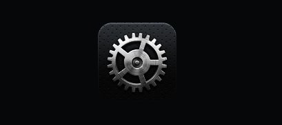
Just to give you an example, you can use a wrench or gear icon for the settings menu, but nowhere else. The reason is people associate gears and wrenches with settings and preferences, so using a wrench or gear for page layout, editing or something else will make things hard for the user.

If you’re designing icons you’re probably looking for some creativity and that’s okay, but only as long as they still invoke the same universal imagery so people don’t get lost. Just think of icons as road signs that people use to follow. In this case, the icons are used to help people navigate your website.
Icons Need to be Consistent
The other thing you need to consider is that icons have to be consistent because if they’re out of context, it will lead to bewilderment. That’s the reason why consistency is very important because it ensures there is no slowdown or breakdown in the flow of information. Simply put, any time that information breaks the user will lose confidence in the website and might look somewhere else.

One way to ensure consistency is to use the same color scheme for your icons. Using a consistent color scheme goes a long way towards stabilizing their appearance. In addition, people will remember your website’s design and how useful it is. It will also help if you use similar shapes as they function well as memory tools. At the same time you must not go overboard with the design. Adding borders, shadows and lots of colors make icons look confusing, so keep things as simple as possible.
Icons Must Complement the Website Design
The icons need to have helpful illustrations that are compatible with the overall design of your website. Before you design any icons, consider the overall look of the site. Is it comical, formal, plain or fancy? Answering these questions will help you decide what features to use as well as what colors to implement.
Use Functional Icons
Icons may look fancy, but the bottom line is – they need to be functional, and function must never be compromised in favor of design. One of the more common mistakes made by web designers is adding too many icons, which should be avoided. Icons are first and foremost designed to help people navigate your website or software. There are many other areas on your website that can be spruced up, but not icons.
The simple rule is this: use only the icons necessary, no more, no less. Too many icons can be confusing and actually defeat the purpose, so use only when appropriate.
Help the User Understand
Whether it is for a website, application or another project, never lose focus of the basic fact, and it’s that icons are tools used to make an impression on the end user. They play an important role in helping the user understand the context of your project or website and how it is supposed to work.
When designing or buying icons, it’s good to invest in those that are scalable so you can resize them easily. Gif and PNG icons are nice, but you can’t scale them without distortion. But if they’re the exact size you need and don’t plan to change the dimensions, they will do just fine.
Because icons are small, you need to design them properly so the message may be conveyed quickly. The important thing isn’t to make the icons as fancy as possible, but as easy to understand without dumbing down the user. It’s true that icons today can be used in different ways on operating systems, programs, mobile devices, websites etc. but the good news is – there are several programs available that can help with the design.
