Textures and Patterns in Web Design
Textures and patterns are not a new thing in web design. Even though trends come and go, textures and patterns seem to always be around.
You might remember the early day websites with low quality patterns at the background. Yes, they didn’t look good. And designers have moved away from them.
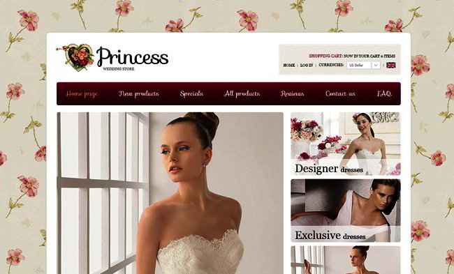
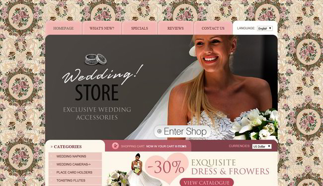
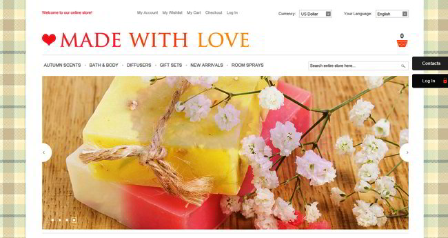
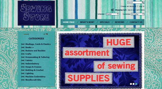
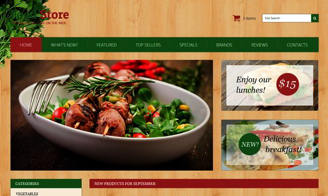
But with the amount of beautiful textures and patterns of the highest quality available today (more often than not they are completely free) there is no surprise we still see patterns and textures everywhere. From the subtlest textures around the edges and on buttons to colourful backgrounds, there are some amazing examples around the web.
Using textures or patterns at the background can provide a deeper feeling to the design, make the elements stand out and thus create a better user experience.
And by using textured or patterned elements you make them more visible. Thus your calls to action become more powerful. By giving your website visitors some accents here and there you can guide them through the website more easily.
Overall, textures and patterns can give your website a unique individuality. Just don’t overuse them! Take a look at these perfect examples of use of patterns and textures in web design.

Responsive JavaScript Animated Template

