4 Reasons to Use Large Type in Web Design and How to Do It Right
It is no secret that when it comes to web design a balance between the visual elements and the text elements has to be maintained. It is not however much often thought of in balancing terms between visually expressed designing aspects and the ones that are displayed using text. Usage of expressive and large typography offers the ability of combining 2 approaches, conveying your message in a textual and highly visual manner.
In this article we will examine some of the specifics behind designing using expressive, large typography. Not only will we discuss the why’s but also some of the how’s that will help you create not only stylish but also an effective website with the use of large type.
So why would you want to use large expressive type?
There is quite a number of ways to make a website refined with the use of large expressive typography. We will look at some of them below. So let’s look into those why’s:
To get their attention.
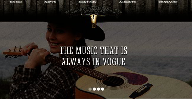
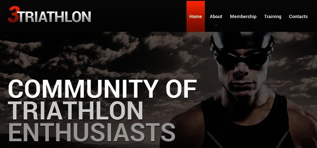
Since the early days of printing the large type has been here to grab the reader’s attention. Especially if it stands out from the rest of the text. Large type practically screams at the viewer:”Look at me! Focus on me!”. This is what makes it so great for the elements you want your website visitors to see immediately, such as calls to action and main titles.
With such a track record, it is easy to see why this technique has followed along with written word. Even if you don’t change the colour, inclusions of expressive typography will direct focus as well as attention of users wherever it is required.
To make them feel.
More than just attention grabbing, oversized, and bold text will connect with readers in other ways as well. The perfect way of evoking specific emotional response in viewer is by using expressive typography. How we feel would play a major role in the manner we act, this makes the type we select for designs that much more important.
Once we managed to get a visitor emotionally involved in the website we can create a rapport with them that much easier and keep them coming back. However, this is to be done carefully, with much thought and planning, because emotions created by us can be just as negative as we’d hoped they would be positive.
To set up hierarchy.
In this fast world people tend to scan pages more that read them thoroughly. You want your website visitors to be able to easily find the most important elements in seconds, if they can not do that they’ll go to the competitors just as fast. So, using large type you can easily establish the hierarchy. Breaking the dull page, emphasising the important points we can draw the reader in, make him pay attention, not just scan and leave. Hierarchy is also important to guide your visitors through the page, believe me, people appreciate this.
To emphasise your message.
Enhancing the message you are trying to convey will help maintain the brand consistency.
Such type of branded boosting of the message is a great way of adding style for reaching out. Using expressive type we can make the brand message look more personal, make it people-friendly, not just a bland, dull thing everyone does. This approach will help you make your brand unique, and people love unique things.
So now that we know the why’s lets look into the how’s.
Make it simple
It will be tempting to make use of several different typefaces as all of them look good and all fit the theme of your website. It is however best to stick to only couple of varying fonts for keeping things from getting too garbled. General rule here is two, since one is boring and three is already too much. Remember though that every rule has exceptions, just make sure it is not overwhelming for the reader.
Harmony
Is your type blending well with other elements present on the page or is it ending up distracting? Is it throwing off overall balance of your website? Is it keeping with feel and theme of rest of the website? Is it overpowering other vital elements? These are really important questions that one must consider for complete visual harmony of elements.
If your answer to these questions is no, you should probably reconsider your font choices.
Readability
Playing around with the fots don’t forget why they are used on the website in the first place. We write text with those fonts, and the text has to be read! So make sure whatever typefaces you end up using are readable.
In case you are not sure about a font, try asking someone who has no idea as to what it should say when they read it. If they are able to read it, you are clear.
Here is more for you to read about typography in general and expressive fonts in particular:
100 Design Principles for Working with Type
The Essential Guide to Typography
Guide to Typography for Print and Web Design


