Make Your Business Website Look Professional in 6 Easy Steps
Recent statistics show that business category is one of the most called for in web design. And it is understandable. New businesses appear each and every day, and each of them wants an awesome online presence to attract potential clients and impress existing ones. And all these new business websites usually utilise the latest trends in web design. They all make use of bold colors, accommodate a lot of content and try to implement features no one else has. Thus, these non-functional websites that lack style appear every day. Is it really good business practice? I think not.

A good business website should be clean, clear, simple and a little bit creative. The main things a really good corporate website focuses on are customer support, non oppressive promotion and engaging investors. The navigation should be intuitive, the layout minimalistic and the website is to look up-to-date. These simple things are what make a business website look professional and lead to more conversions.
If you already have a business website and would like to make it perfect or if you are just planning your online presence – this article will show you the way to avoid the most common mistakes and describe the steps taking which you’ll make your corporate website flawless.
Colors should be trendy but not overwhelming.
Colors are inseparable from web design, it is design after all. The first thing a web designer does when starting a new project, well, one of the first things, he creates a color scheme for the upcoming website.
Designers tend to rely on the latest trends and this is not usually good. Why? Well, one of the recent trends in design is bold colors, but they don’t look good on a business website. Do you really think a financial institution will have credibility if its website’s background is bold orange and the typography and elements are fuchsia?
So the thing to remember here is – do not blindly follow the fashion, use the colors that complement your business and make the website look professional. Traditionally the colors that are good for a business website are white, grey, beige, blue and green. All these colors have many shades you can use. And do not think these simple colors are outdated, blue-green or sea-green for instance is very in the past few years.
You can use more vivid colors in your design, but make use of them in the details. Colors contrasting to the background will look good on small elements and typography. Do remember that not all colors look good together though. We suggest you to check out the latest collection of the best corporate WordPress themes to build your very own website with perfect color variations.
Proper combination of colors will make the site easy on the eyes as well as simple to read. You can also say that improper mixing of colours will take your website to bad user experience as well as cause dramatic harm to your business.
Don’t forget to introduce yourself.
The main issue faced by several business related websites is they don’t include introduction sections. I’m sure you’ve come across a website with no info on what it’s all about really. I know I’ve seen a lot of those.
Wouldn’t you want your visitors to know what they can expect to get from you? That’s why I recommend implementing an introduction section on your home page.
Introduction sections are jquery sliders, content blocks, and different geometrical shapes having text. These details allow users to catch information quickly as well as understand what the company is offering them just as they start browsing the site.
Navigation MUST be simple.
Navigation is the one thing you shouldn’t experiment with. I repeat – this is not the place to realize your innovative ideas!
You don’t want your potential clients wondering the website in search of a section, you need them to find what they are looking for in seconds, on the first glance, whatever you call it. This is the way to creating a positive user experience and this thing is the most important one you are looking for when creating a business website.
- Several types of navigation:
- Footer navigation
- Fly-out menu
- Breadcrumb navigation
- Drop-down menu including sub-pages
- Sidebar menu or vertical bar
- Horizontal menu bar
Of course the best one would be top horizontal menu bar. This is immediately visible when a user is loading the website as well as is simple to operate. I have come across several sites that have double navigation, that is one at the bottom and one on top. The idea here is that users don’t require scrolling up while they are staying at the bottom of the page and the other way around. This is comfortable, so I think it will do good for a business related site.
Another type of navigation that many business websites use is sidebar menu.
It is pretty good in terms of convenience and has been proven good by the years of usage by hundreds of websites.
Do not overuse the multimedia.
I admit – there are websites where extensive use of multimedia is appropriate. Those are websites that focus on music or movies, photo portfolios and wedding albums. Not business websites.
This does not mean you can not use multimedia at all. You can use photos, even videos. Just make sure they are put where they serve a purpose, don’t overwhelm your visitor.
Add a contact form.
I don’t know about you, but I go completely mad when I can’t find contact information on a website. Especially if it’s a business venture. Wouldn’t you want your customers to have an easy way to contact you? Who knows, you might get a once-in-a-lifetime business opportunity via a contact form! Anyway, no contact info at all is a very bad business practice.
Speed up!
Last but not least – make your website fly. This is very important. The user has to be able to load your website in a blink of an eye. Otherwise he’ll find your competitors in just the same time.
- Simple rules to make your load time faster:
- compress your images
- compress your HTML, CSS and JavaScript
- delete all the unnecessary plugins
- use fast web host
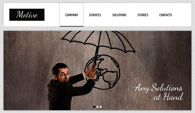
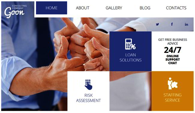
All of the above steps can easily be taken if you use a web template to create your business website, since all of them are easily customizable. So here are some beautiful examples of clear, simple and professional templates for you:


