Basic Principles of Flat Design
Throughout the past decade, web designers have been exposed to a variety of new features. Shadows, bevels, 3D buttons, and textures are just a few of these. The common design that shares these traits is known as “skeuomorphic” design. Unfortunately, many designers have overused these design traits to make websites that appear “gimmicky”. You’ve probably seen these websites before: the ones that are covered in flashing buttons and crazy textures. Recently, people have been moving away from this design and moving more towards a design known as “flat design”. Flat design focuses on moving away from the design features that are flashy, and towards the design features that are useful for users.
Flat Design
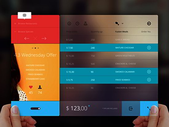
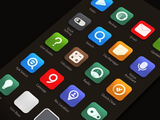
While there is a wide variety of website traits that can fall under the category of “Flat design”, several key traits stand out from the rest and really define what flat design is. Flat design is ultimately defined by its simplicity and by its ease of use. This is one of the features that makes it so attractive to web designers. The very nature of flat design – clear, clean, and open interfaces – means that flat design is very user-friendly, especially for users who are new to the system. This can be seen in the Microsoft’s Windows 8 operating system, which utilizes flat, simplistic tiles instead of typical computer icons that resemble realistic objects. This distinction between simplistic tiles and realistic-looking icons is another key feature of flat design. The flat tiles are where “flat design” gets its name from.
Get Rid of Gimmicks
As was mentioned in the first paragraph: the main purpose of flat design is to get rid of
gimmicky tricks. This means that flat design doesn’t use any shadow, beveling, or layering effects that you might see on other sites. While it may seem at first glance that this would kill the creativity of the webpage, the truth is, it’s actually the other way around. Flat design gets rid of cheap tricks and forces designers to make good user-friendly websites that stand out without looking bad. Instead of using flashing displays or complicated menu systems, web designers figure out how to make interfaces as simple and effective as possible. This greatly increases the usability of many programs.
Fonts
Flat design makes perfect sense in the sense of getting rid of excess and elaborations that some web designers have abused over the previous few years. Flat design also focuses on using minimalist fonts. Fancy fonts or lengthy explanations have no place on a flat designed webpage. Instead, simple-yet-effective text and explanations serve to make the experience as simple and user-friendly as possible. Since the goal of flat design is to minimize the clutter and make everything appear crisp and clear, it wouldn’t make any sense to add long, wordy explanations.
Color
If you have seen any flat designs at work before, then you know that color is also a key
component of any flat designed webpage. Instead of just a few colors, designers may use as many as eight to really make a website pop before the eyes of the viewer. Also, where older web design techniques usually only use one or two bright colors, sites that use flat design tend to use many bright colors. Due to the flat design of such a site, the bright colors can help enhance the appearance of the tiles. Since the design is very simple and clean, many colors can be used together without the site appearing hideous.
The absence of typical skeuomorphic traits such as 3D objects or shadows allows flat sites to experiment more with color, which many do.
Microsoft and Apple
If you still are unsure what exactly flat design is, then take a look at the design that is its exact opposite: skeuomorphic design. As I mentioned earlier, skeuomorphic design is an older design style that emphasizes using various traits and textures to make a website flashy to attract attention.
Microsoft was the first large company to accept flat design over skeuomorphic, as you can see in their Windows 8 operating system. Apple, another tech giant, has historically gone with skeuomorphic design, but that seems to be changing with their most recent operating system. Apple moving away from skeuomorphic design suggests that everyone is finally moving away from it, and instead moving towards flat design.
Moving Towards Flat Design
Overall, flat design is a rebellion, of sorts, against an old way of designing websites and apps. The newer, fresher style is gaining a lot of traction with larger companies due to its ability to simplify sites for users, while still looking appealing. As more and more people and companies move away from the old skeuomorphic design, many people are converting to flat design. Just as everything else goes in and out of style, so do various web design techniques. They can be in or out of style. It appears that, for the foreseeable future, flat design is certainly in style.


