The Web Designer’s Guide to Designing Personal Logos
Competition is stiff for freelance web designers and developers. You have to go the extra mile to make sure you stand out from your peers—which means creating a personal logo that’s 100% unique to your brand.

Many people scoff at logo design. They’re used to create entire websites, so they think one little logo couldn’t possibly be that hard. In reality, your personal logo is one of the most difficult projects you’ll ever work on. It’s easy to get sidetracked, take shortcuts, or succumb to information overload when you know everything about the brand you’re working for. That is why there are website design guides and logo design guides.
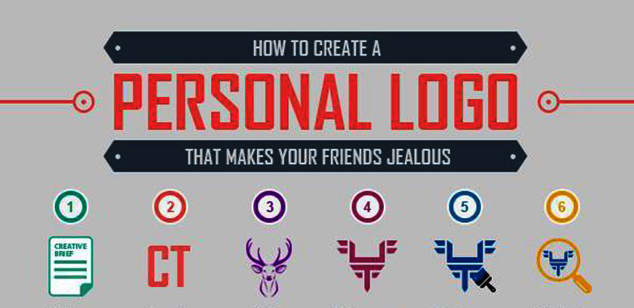
So how do you avoid the pitfalls of personal logo design? You learn from others—starting with the professional logo designers at Company Folders. They’ve compiled 6 secrets to personal logo design that will help make your project a success.
#1: Don’t skip the creative brief.
It’s tempting to save time and skip the creative brief, but this leads to headaches in the long run. Without this sheet of paper as your guide, you’ll likely find yourself trapped in an endless cycle of revisions that eat up your time and budget—especially if you’re new to logo design.
#2: Pick the right name.
Everybody has legal names, nicknames, and abbreviations of these things. A full name can make you sound professional, or it can come across as stodgy. Likewise, initials can remind clients of your name, but they won’t help people who haven’t met you yet. Know how each variation will impact your audience.
#3: Look at what others are doing.
If you have a logo in mind, you probably can’t wait to start drawing it. But when you run straight to the drawing board, you have no idea whether your logo looks too much like an existing design or is too far off the beaten path for your industry. Examining other designs will show you what you should—or shouldn’t—do.
#4: Don’t be afraid to revise.
A lot of work goes into refining a logo, from dodging clichés to simplifying your design to choosing its shape and font. Unless you’re a design savant, you’re not going to hit the nail on the head during your first round of revisions. So cut yourself a little slack and look at the revision process as a learning tool, rather than a headache.
#5: Pick the right brand colors.
Colors impact how customers see you—so make sure your picks actually portray your personal brand. Yellow might be your favorite, but it still won’t convey the professional persona you want clients to see. You’ll need to study color psychology so you know how colors or combinations of colors make prospects respond to you.
#6: Look at what you’ve done.
Finishing your logo concept is so exciting, that you want to release your design right away. Don’t do that! Instead, put it away for a few days or even weeks. You may find that you still love it when you go back to it… or you may realize it needs work. Taking this break lets you look at your project with new eyes and make sure it’s what you want.
Conclusion
Want to know more about looking for inspiration, refining your design, or evaluating your final concept? You can find all of that info and more in this extended blog post.

